
Degree Work
A collection of my various works from my BA design practice course. With a lot of experimentation, mark making and illustrations.
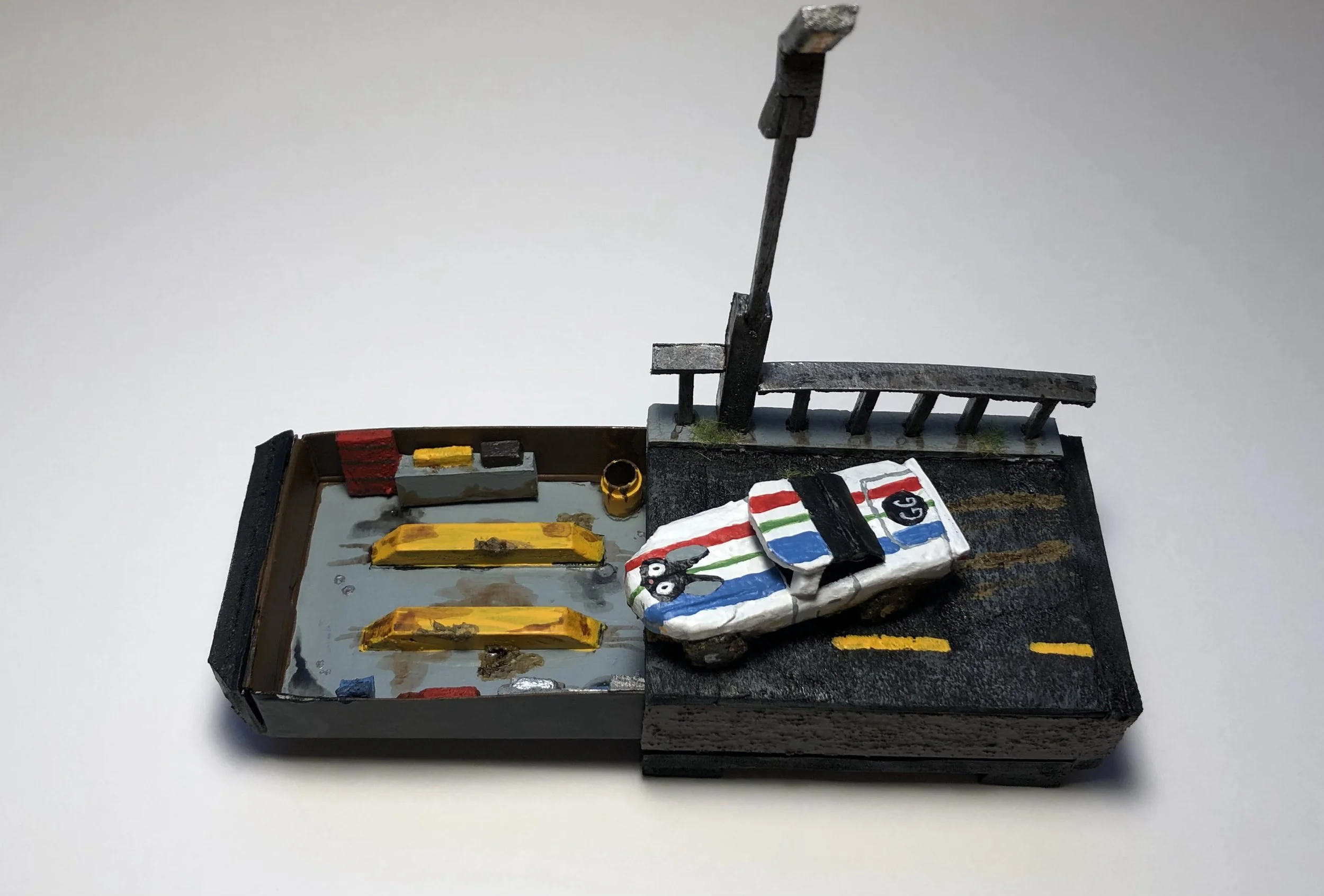
Match box project -
Just before starting our first semester, we were given a match job project. You were partnered up with someone and had to ask them questions, find out a bit about them. With that information we had to transform a match box into something that featured the other persons interests. My partner was very proud of her car and was a huge fan of Kiki’s deliver service.
Mixed Media Posters -
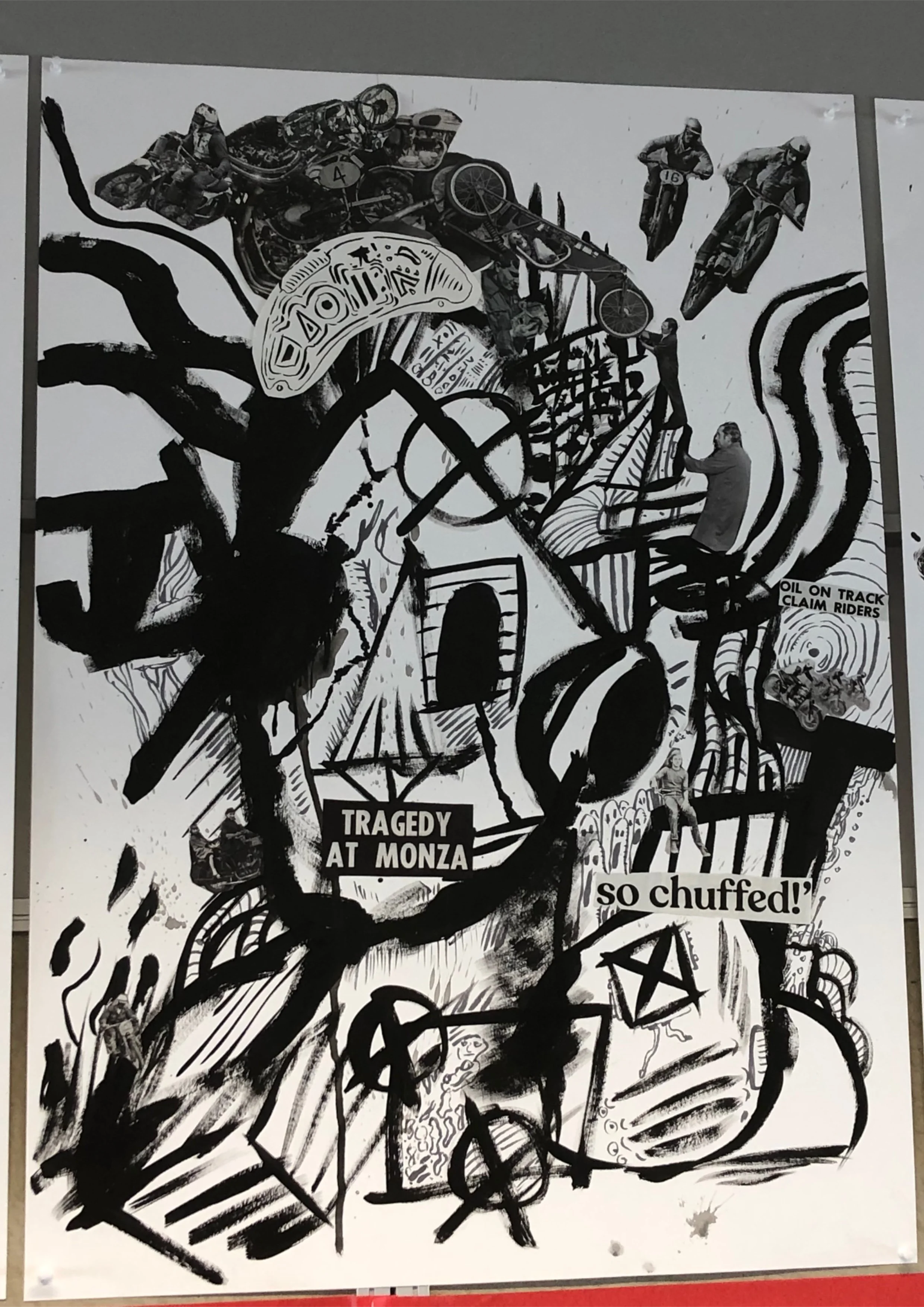
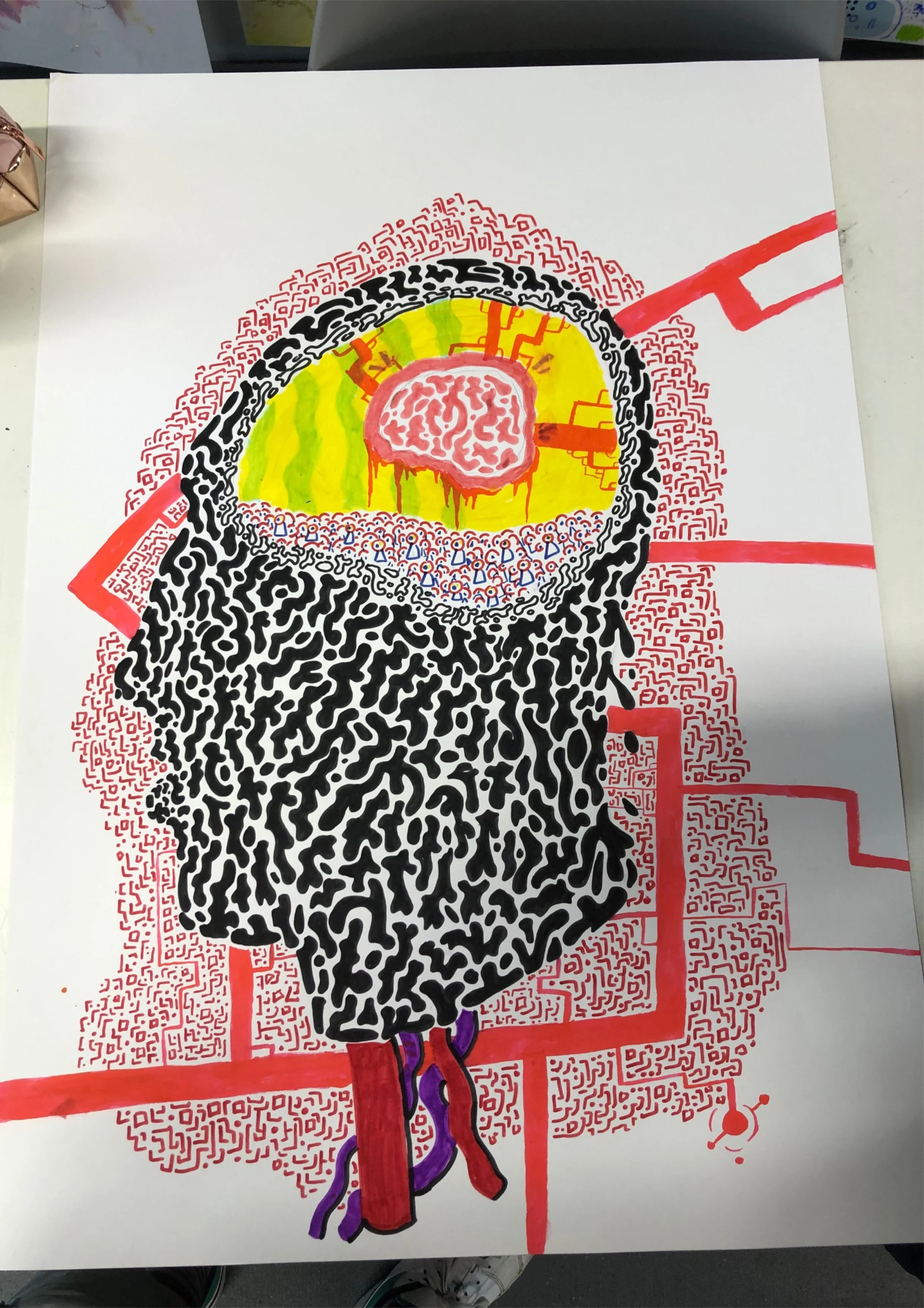
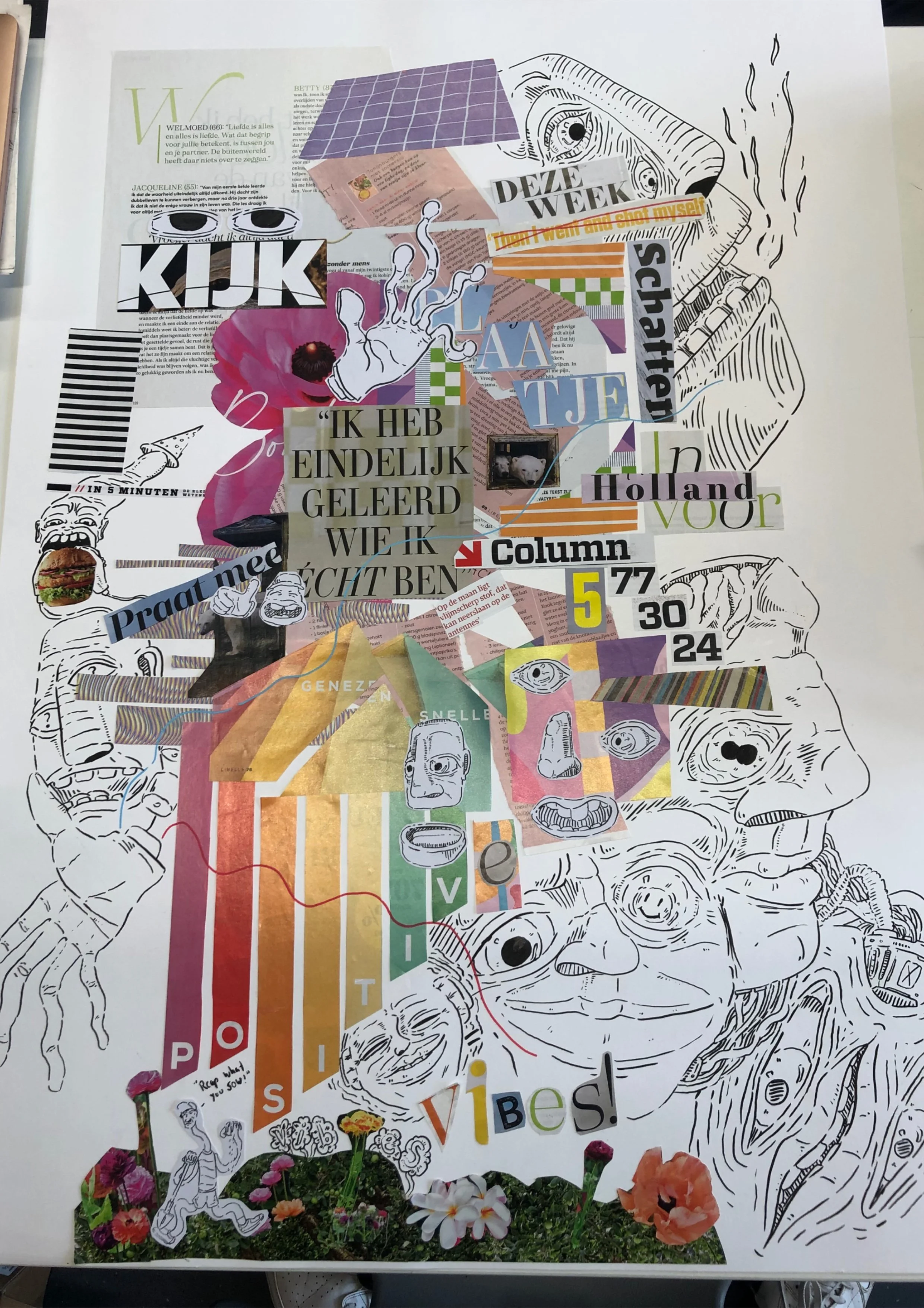
In our first week I made these. Three mixed media posters, One a self portrait, another how we felt, and finally a visualisation of ourselves. While this work isn’t all that great, it did open my eyes to expanding my illustrative skills. And exploring areas I perhaps previously wouldn’t.
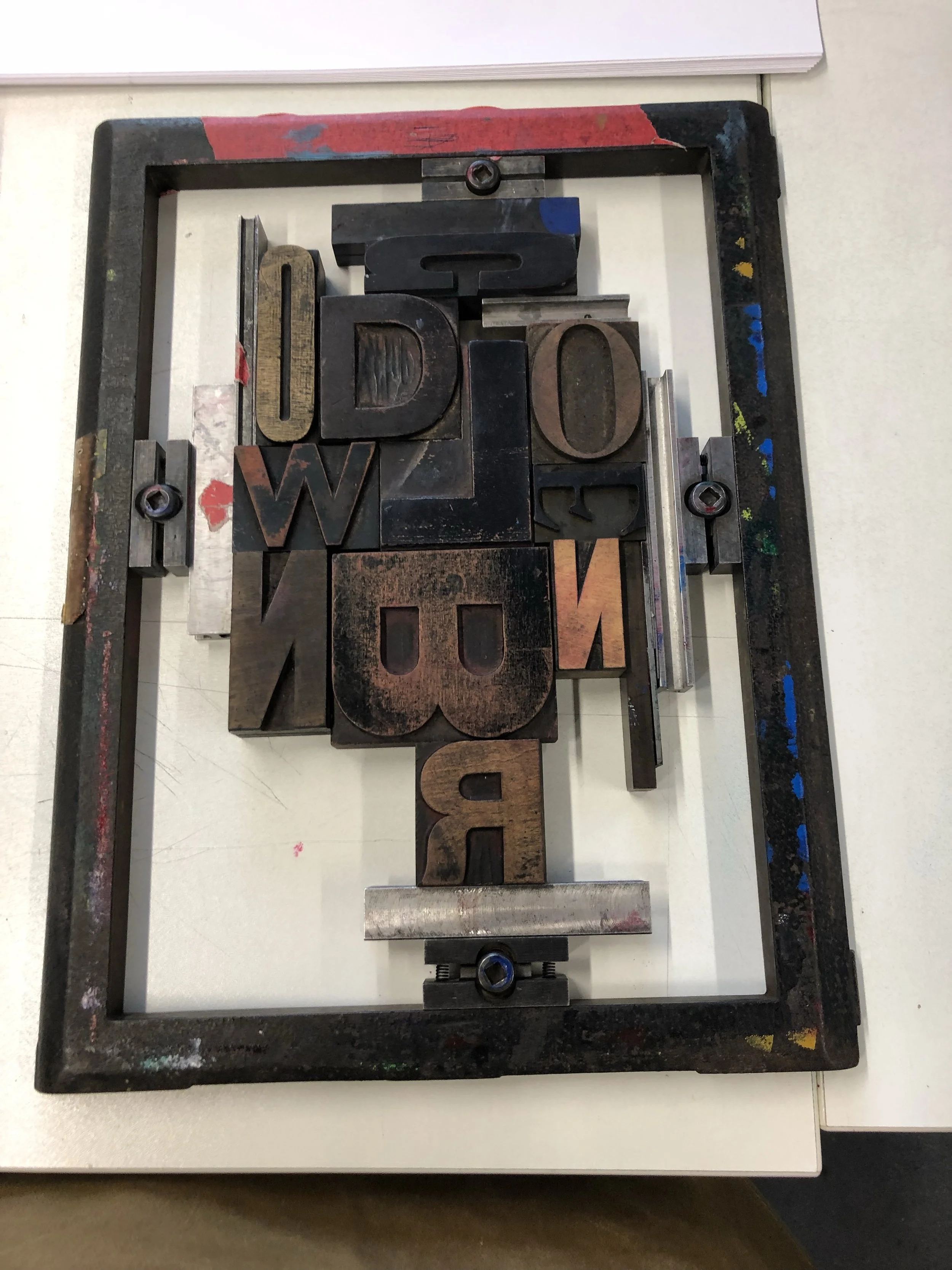
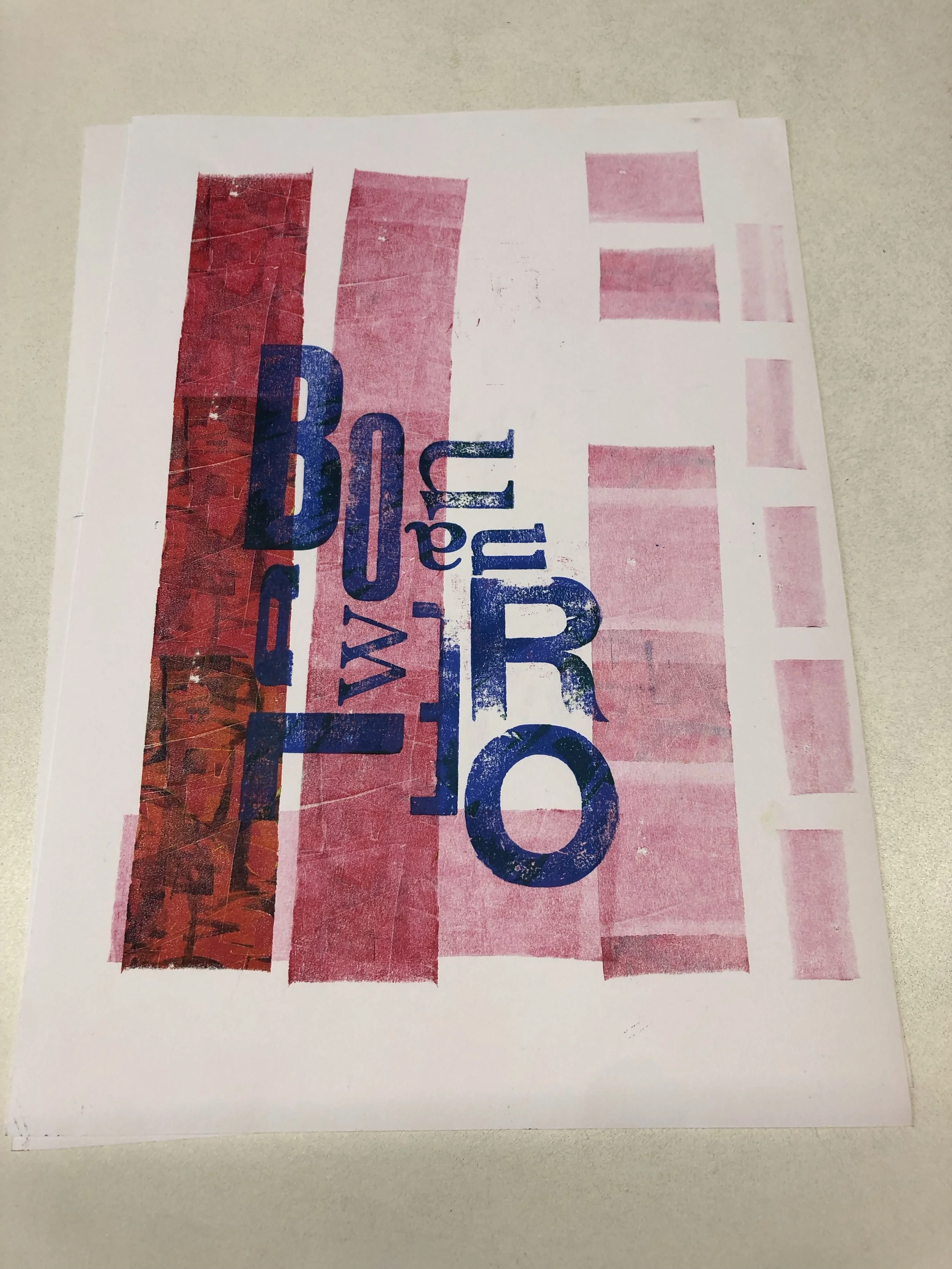
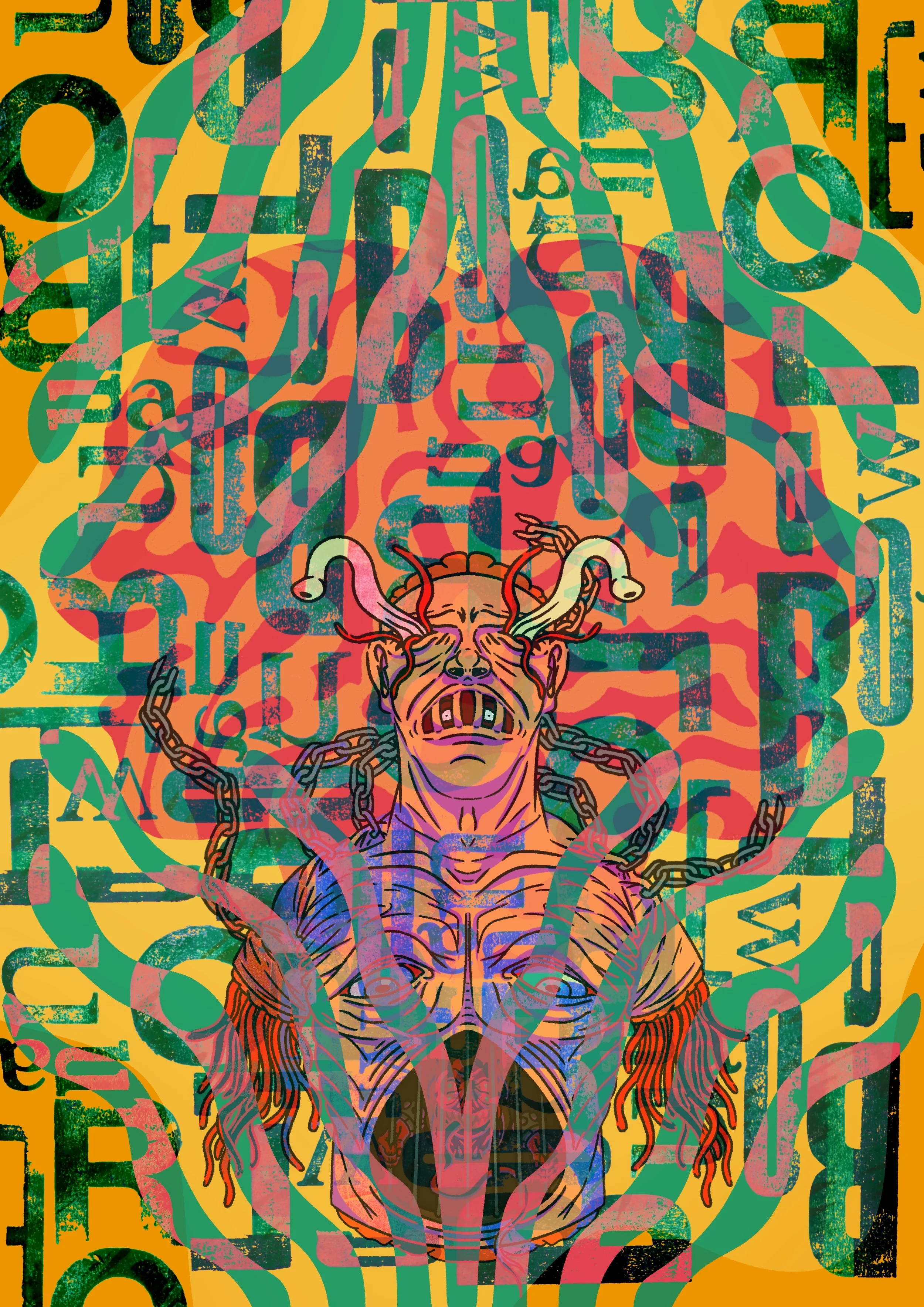
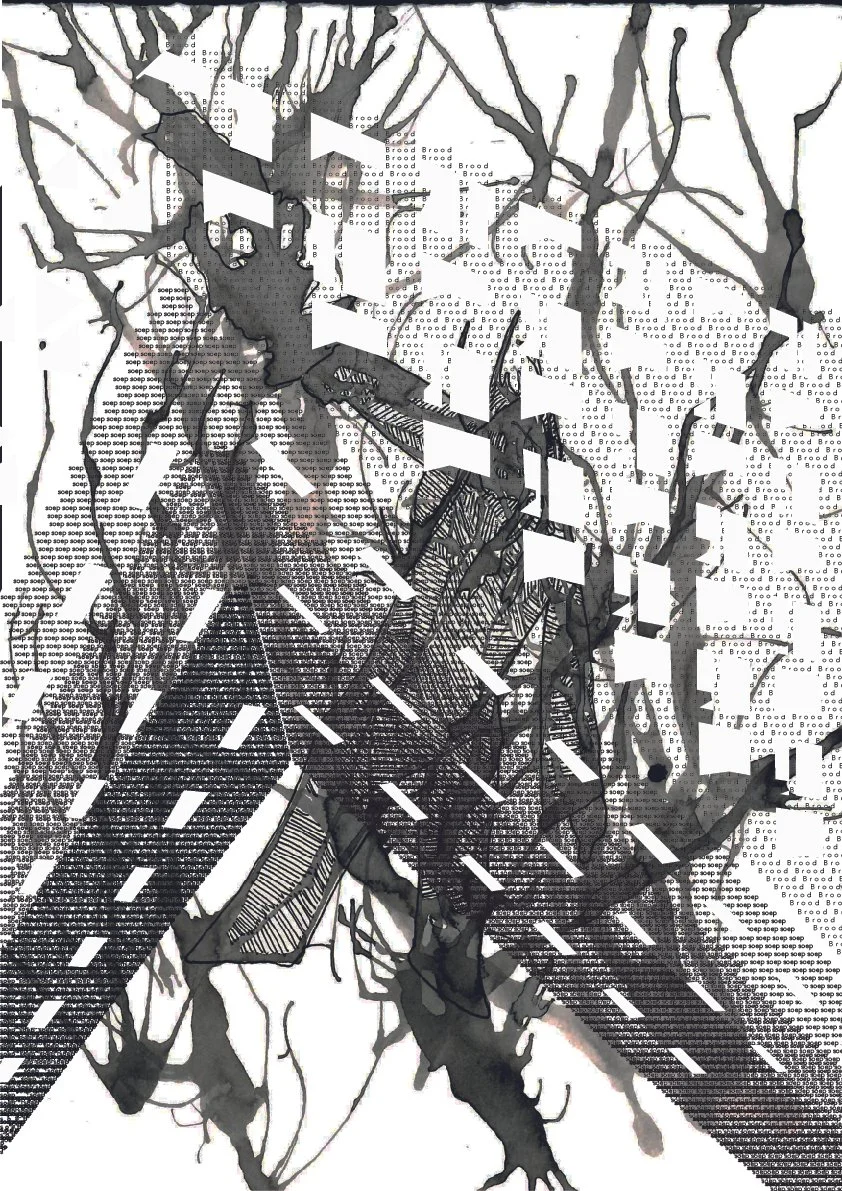
Letter Press Printing -
One of the workshops we had was letter press printing. In which we had to some of the lyrics from our favourite songs. Mine being Golden Brown by the Stranglers. I made a number of prints, with the final outcome being a textured letter press print, and a digital scan which should be digitally altered.
Riso Printing -
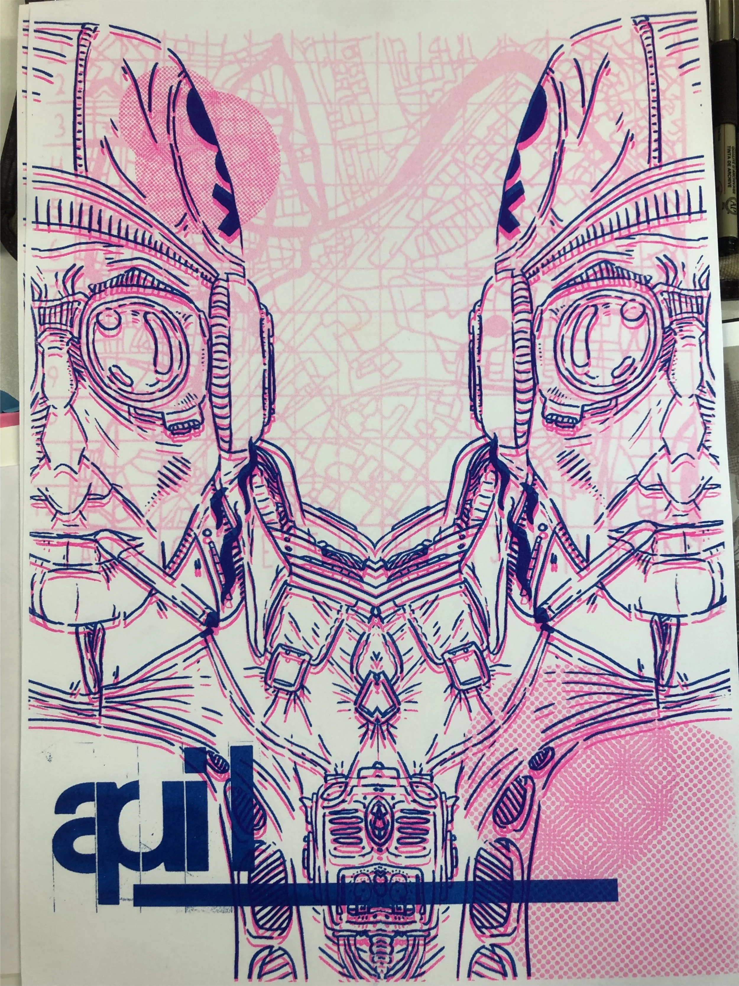
Another workshop we had was Riso printing. This where I was first exposed to this printing method and found my appreciation for it. Even now I still print with Riso as often as I can, and think on what work I’m producing could be Riso Printed. This project was also map based, we had to choose a location of importance to us. I could Lieden, where I was born. This map and elements of it was to be included in the various works.
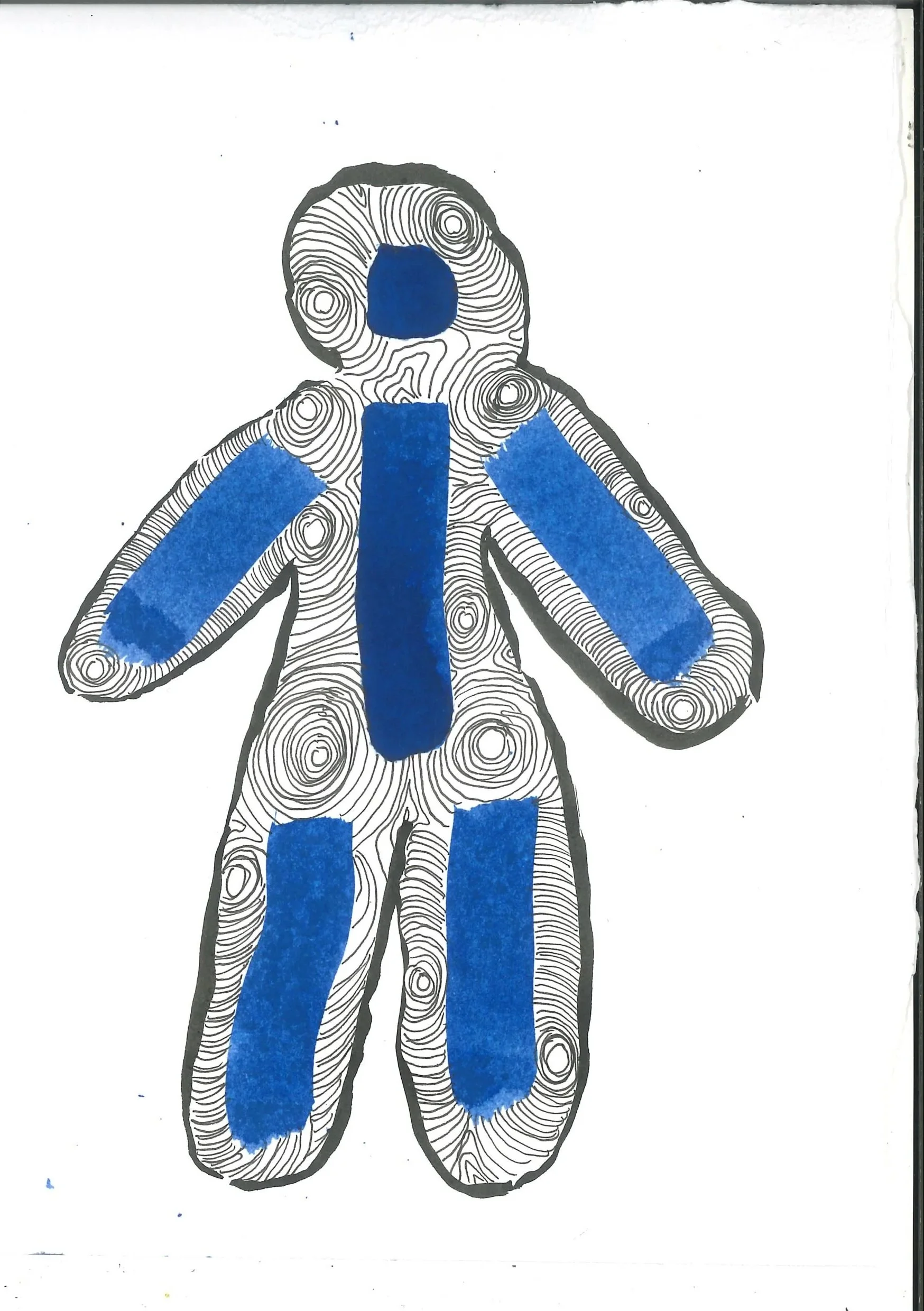
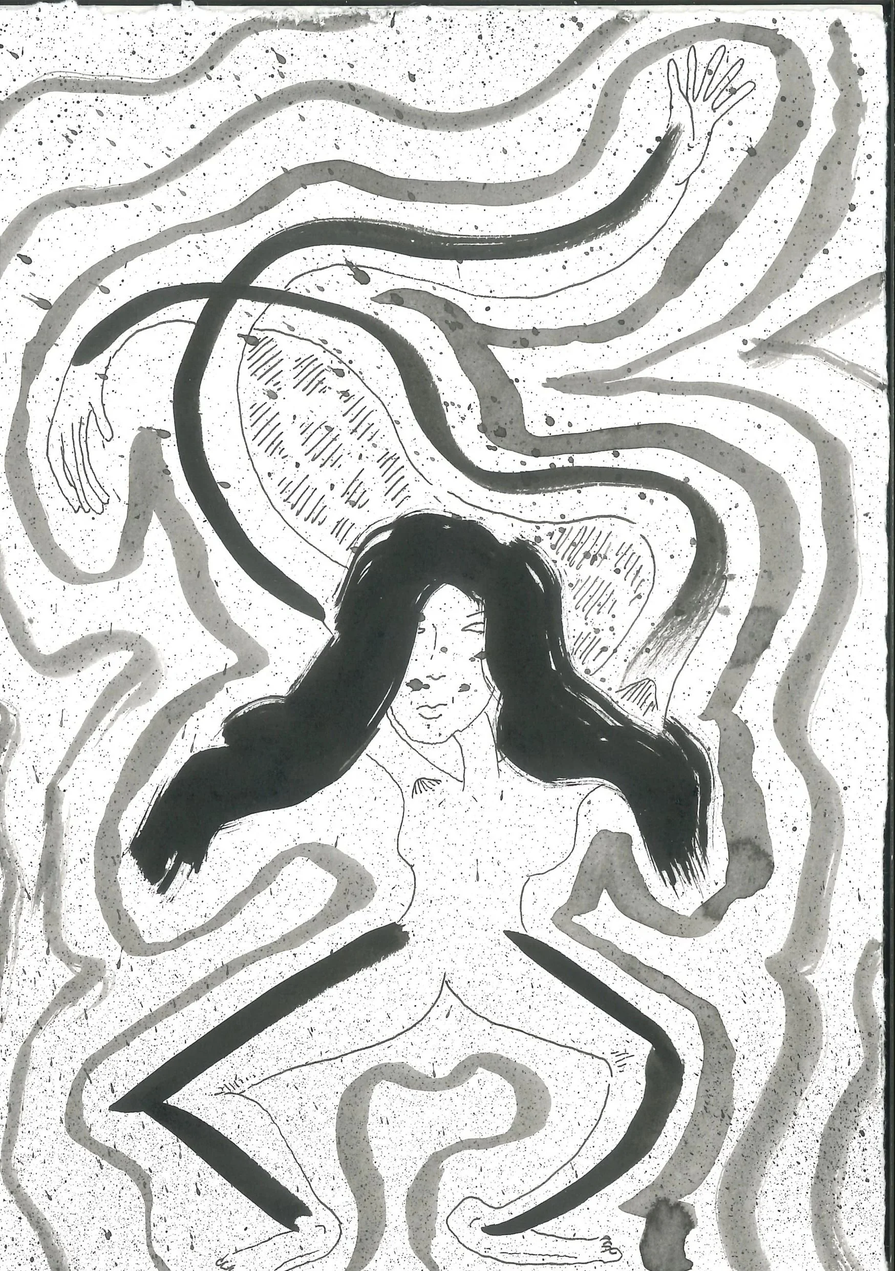
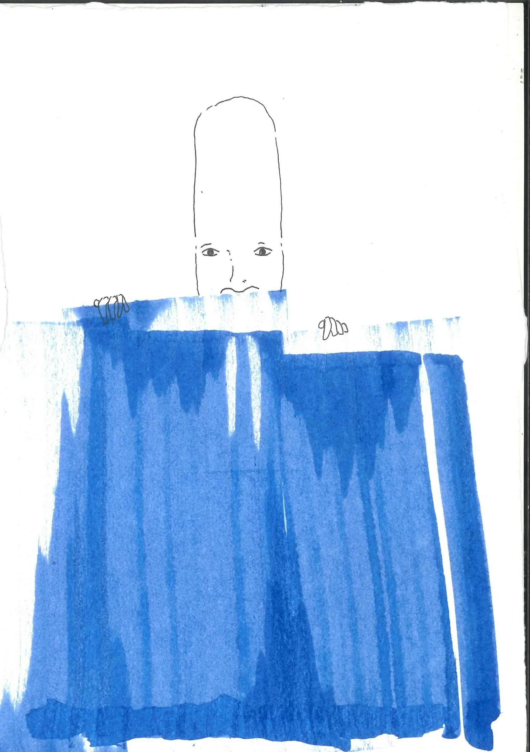
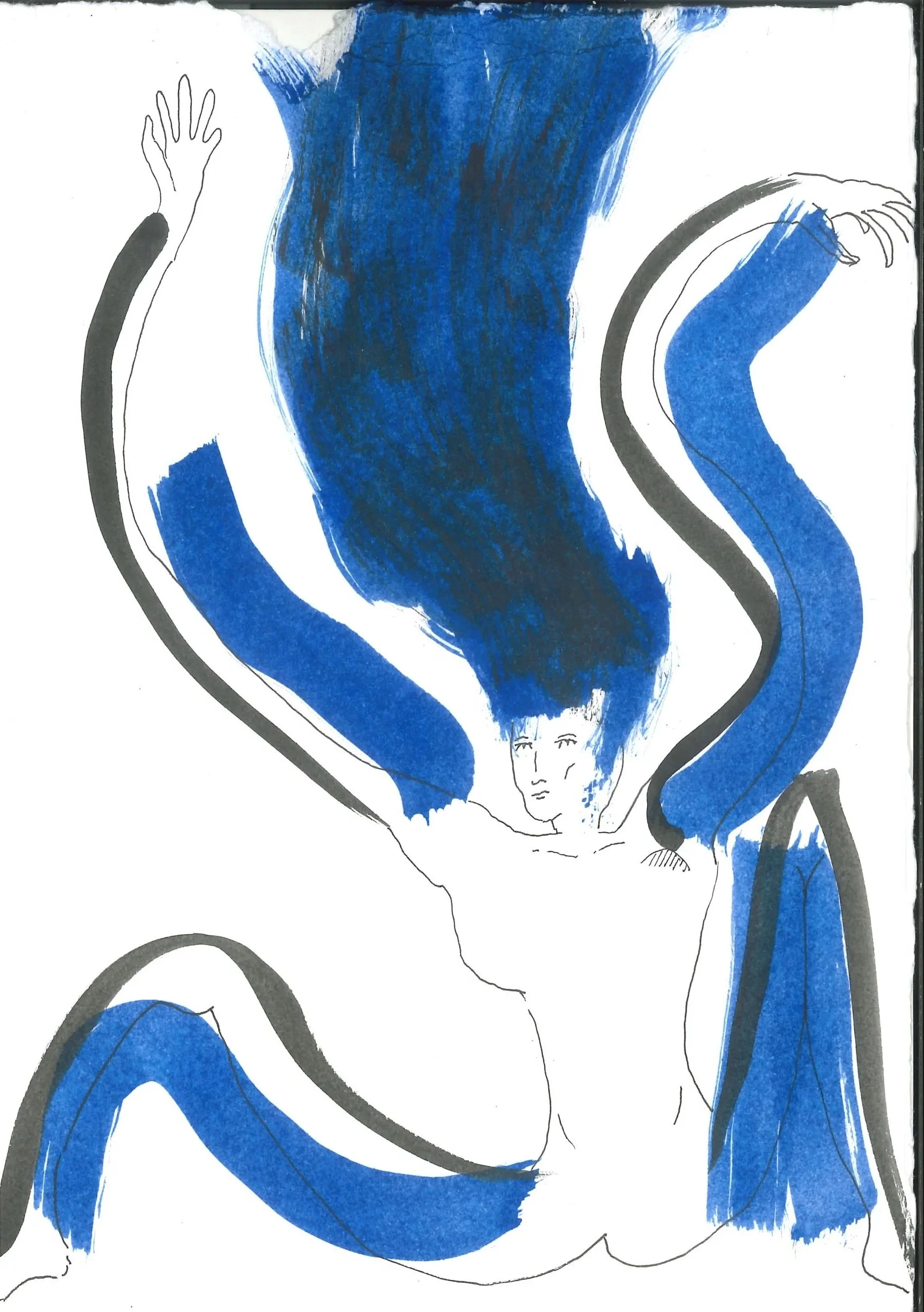
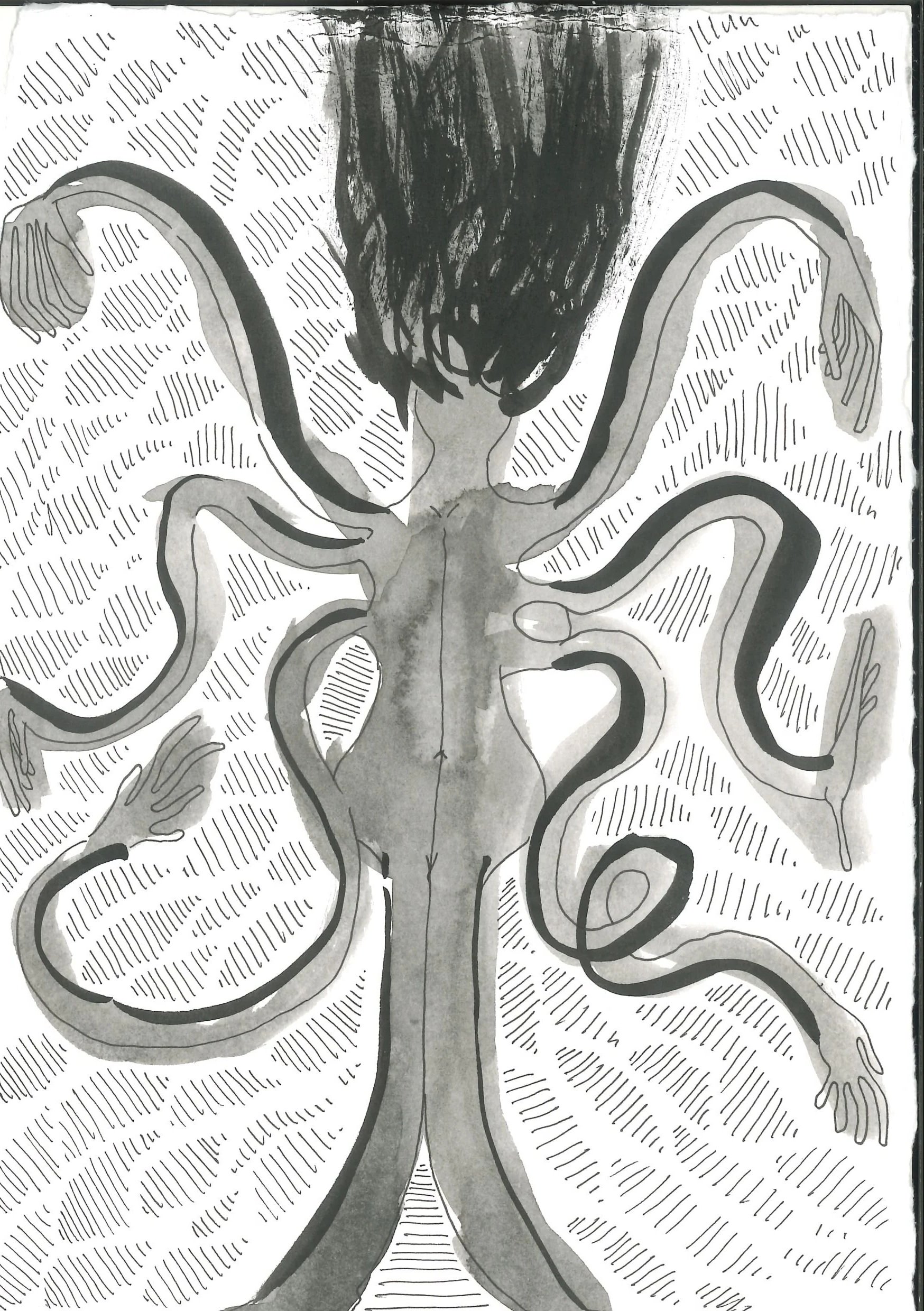
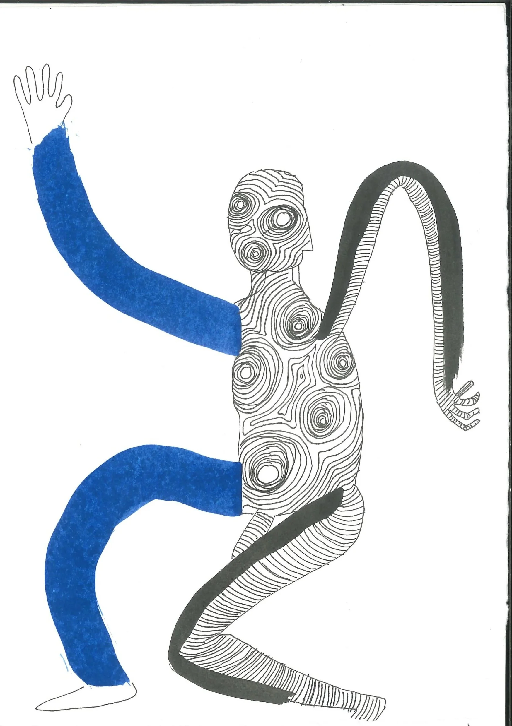
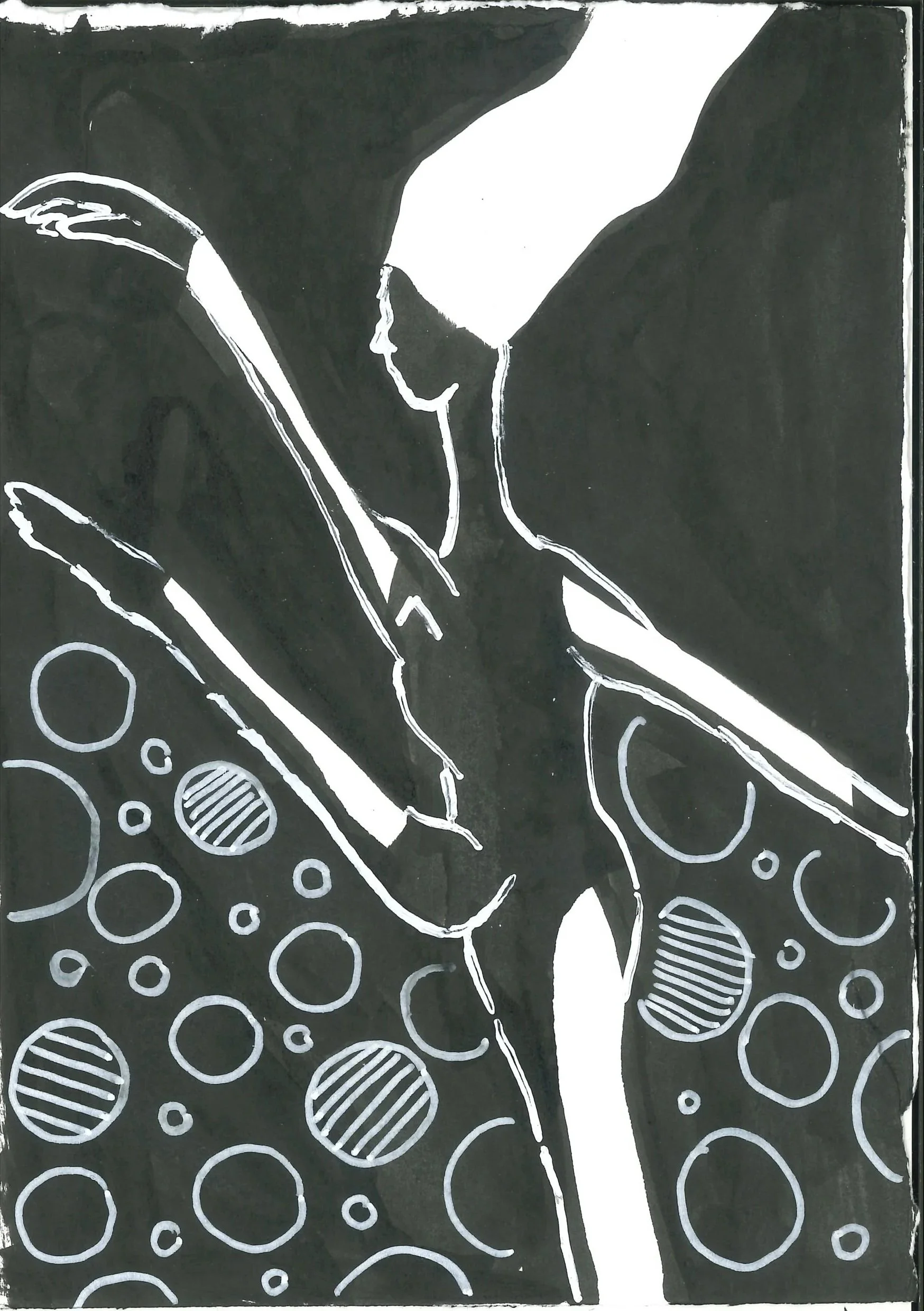
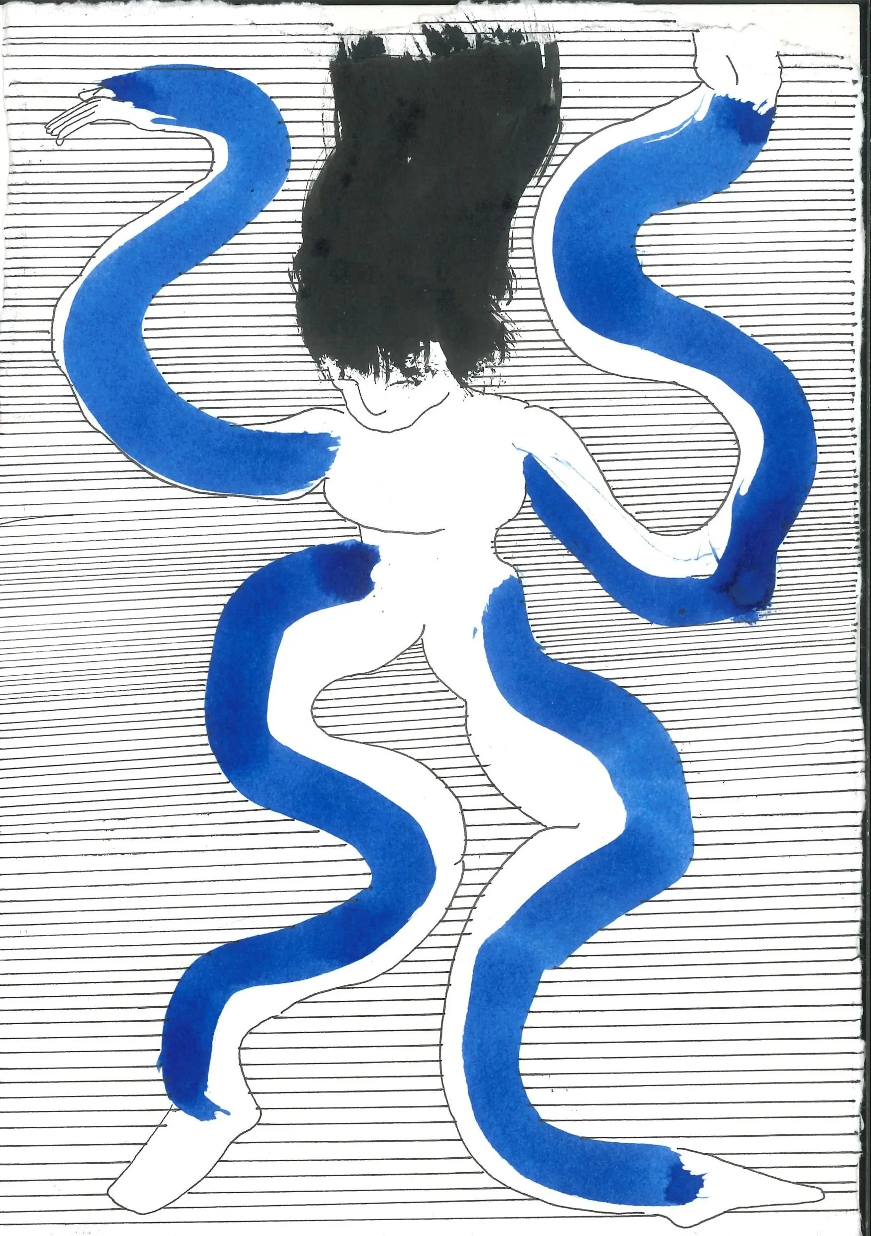
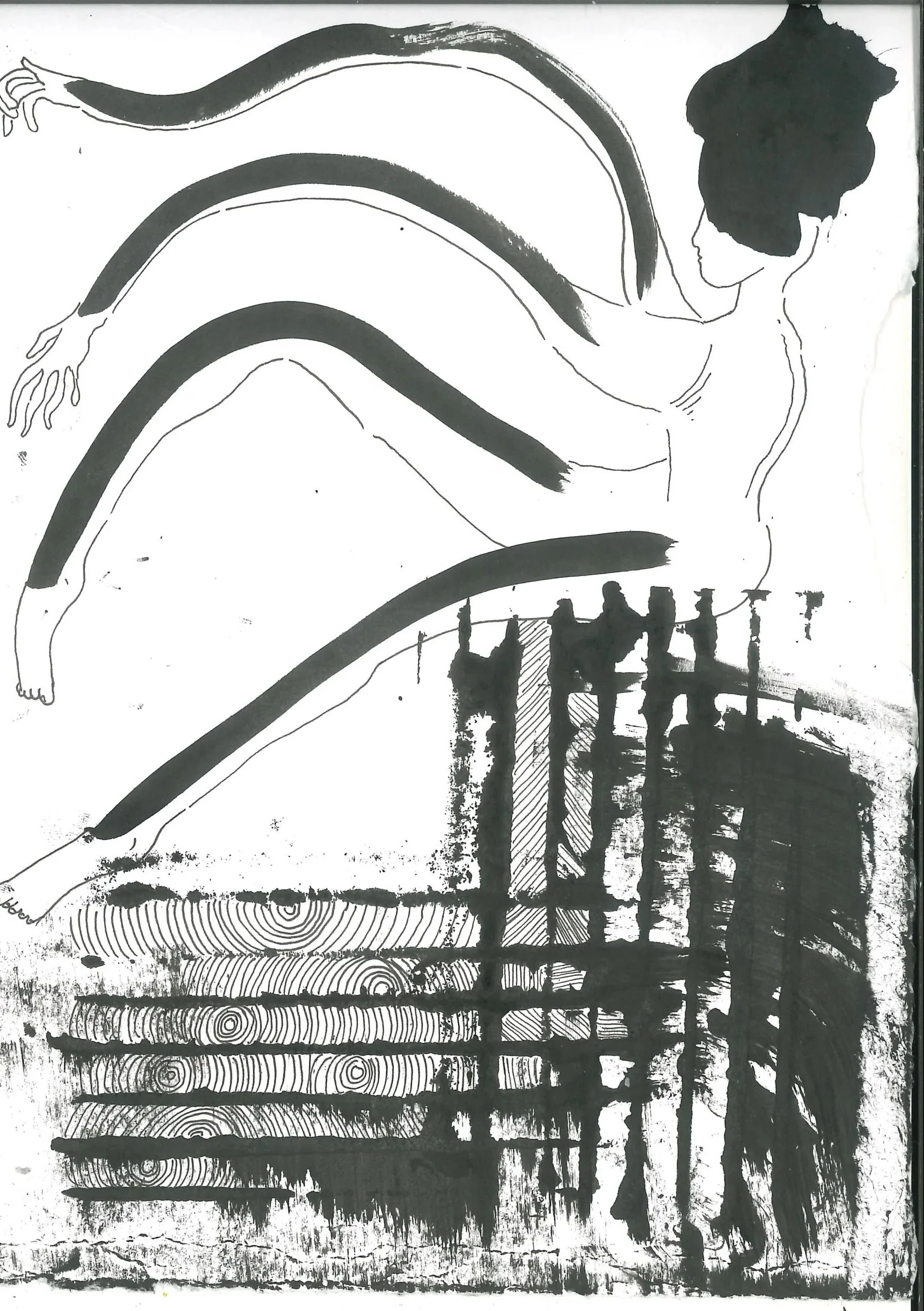
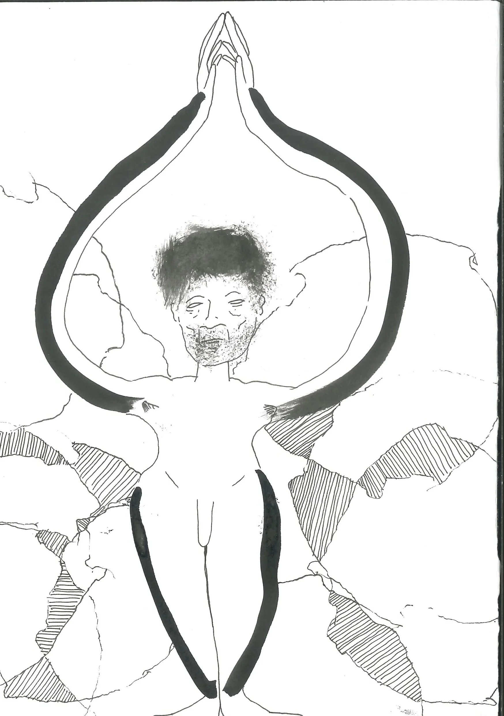
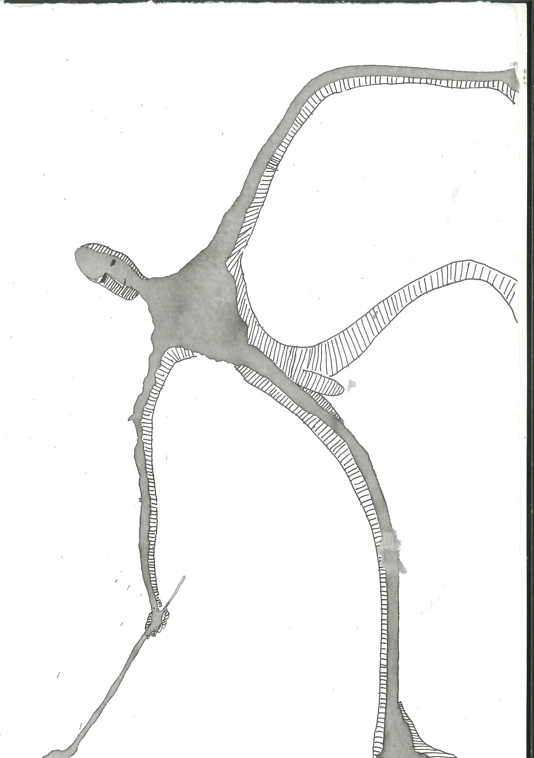
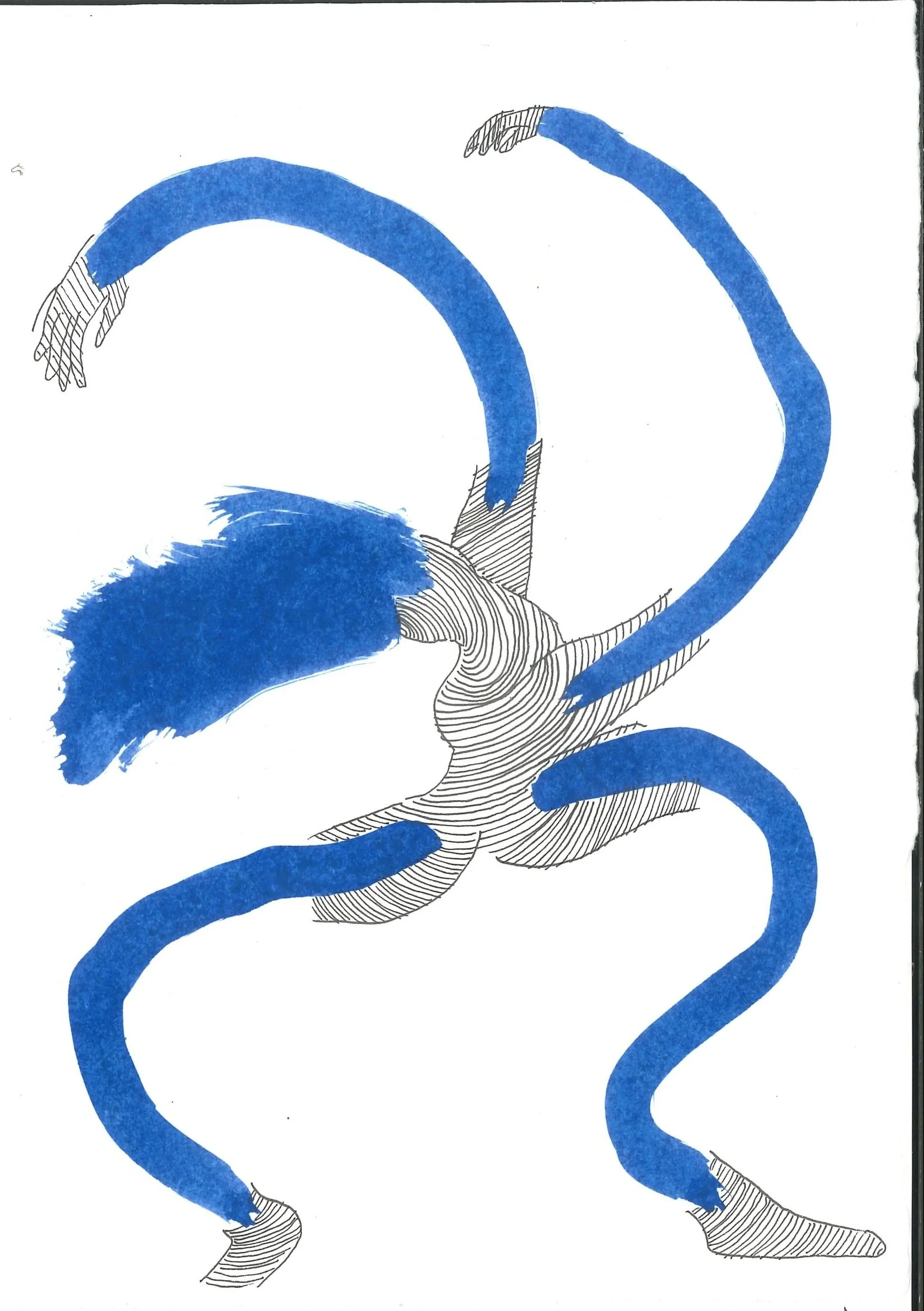
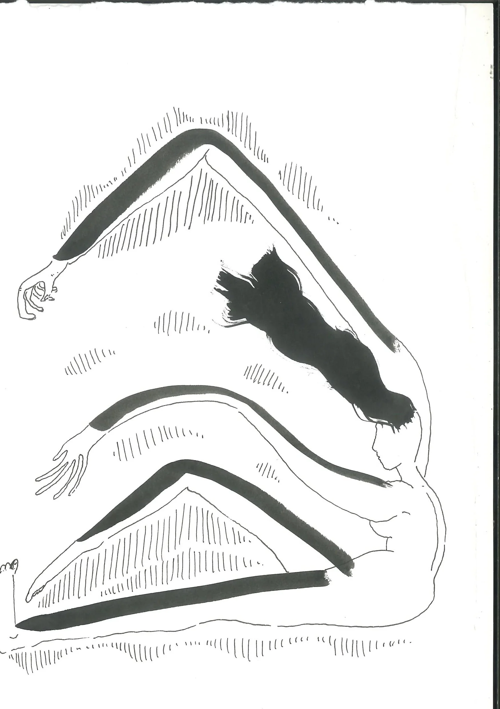
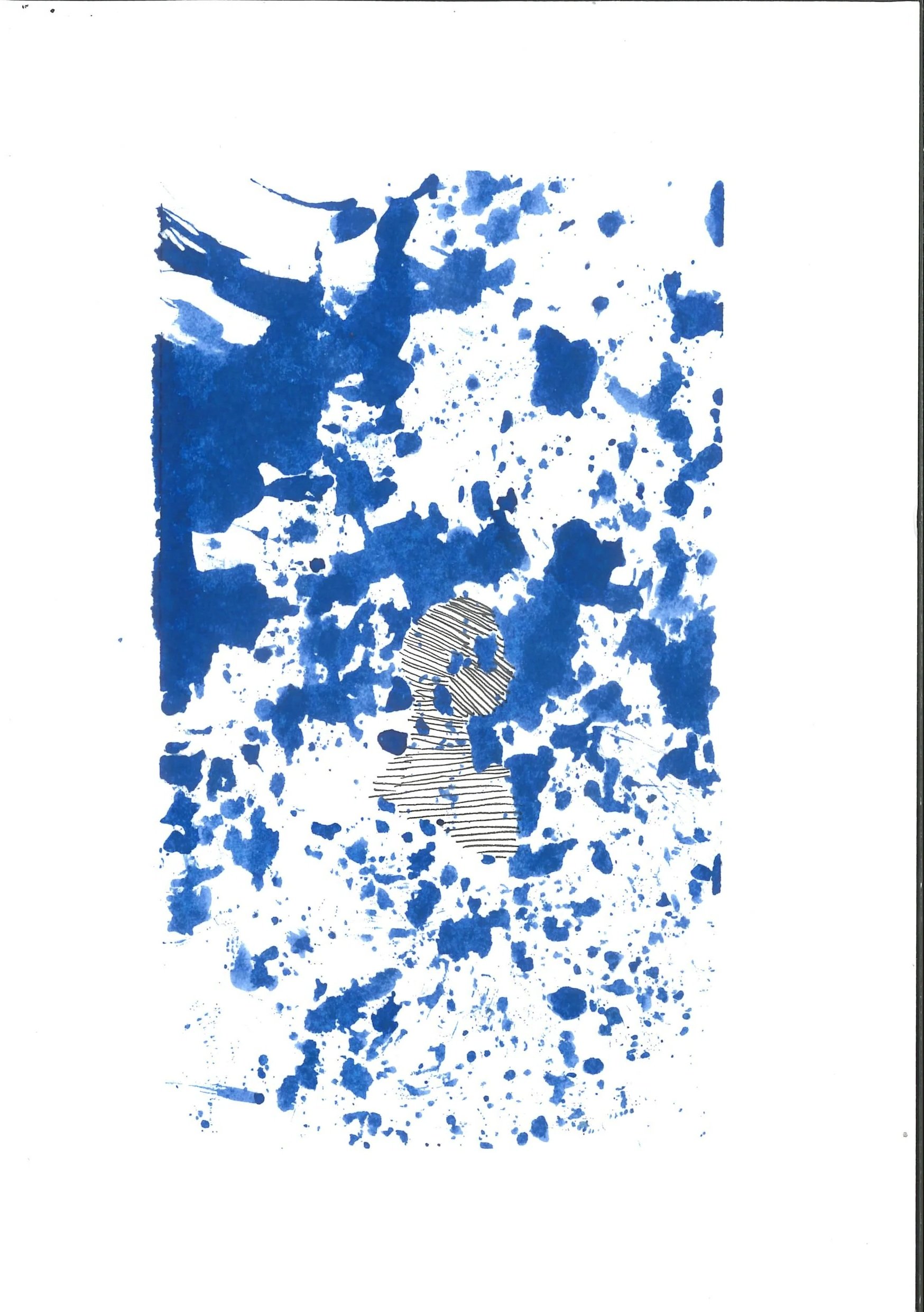
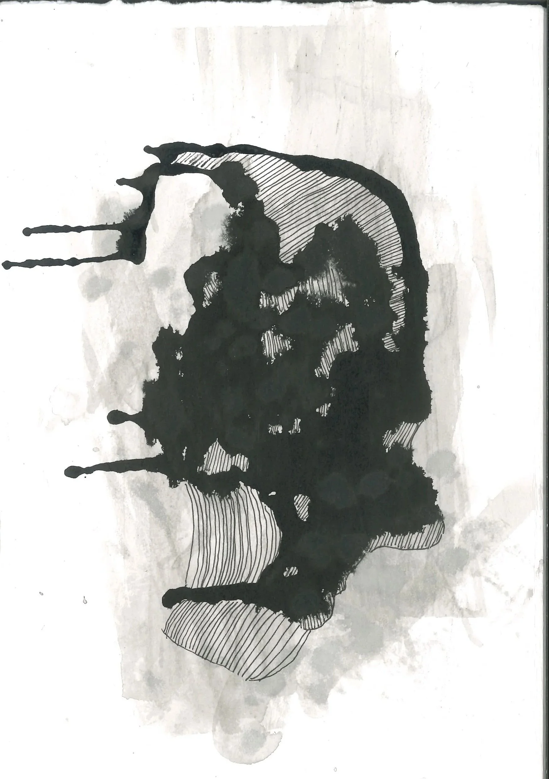
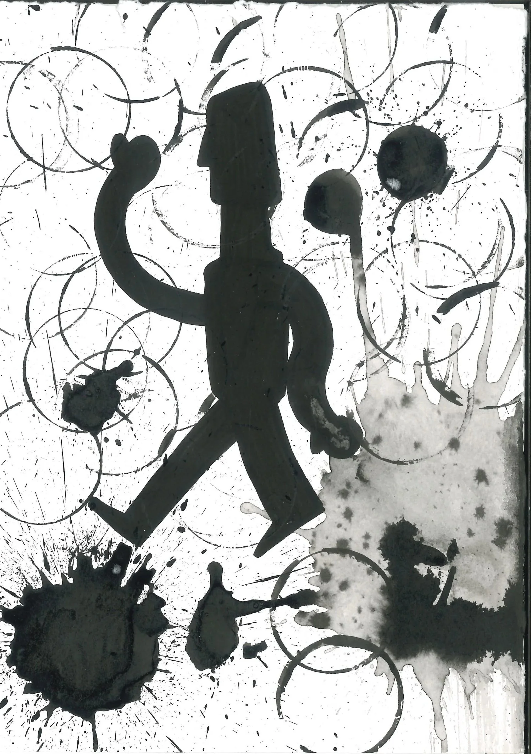
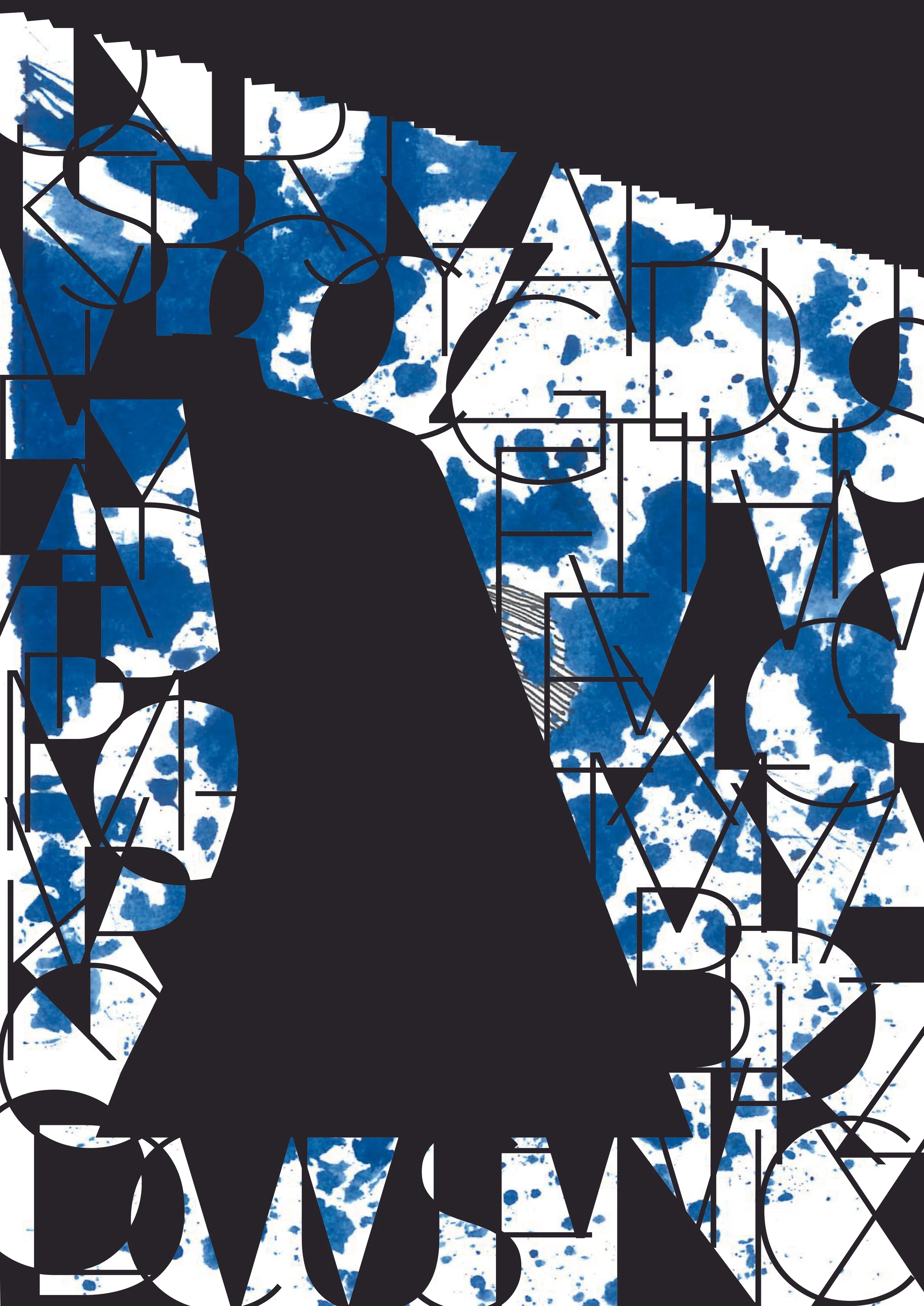
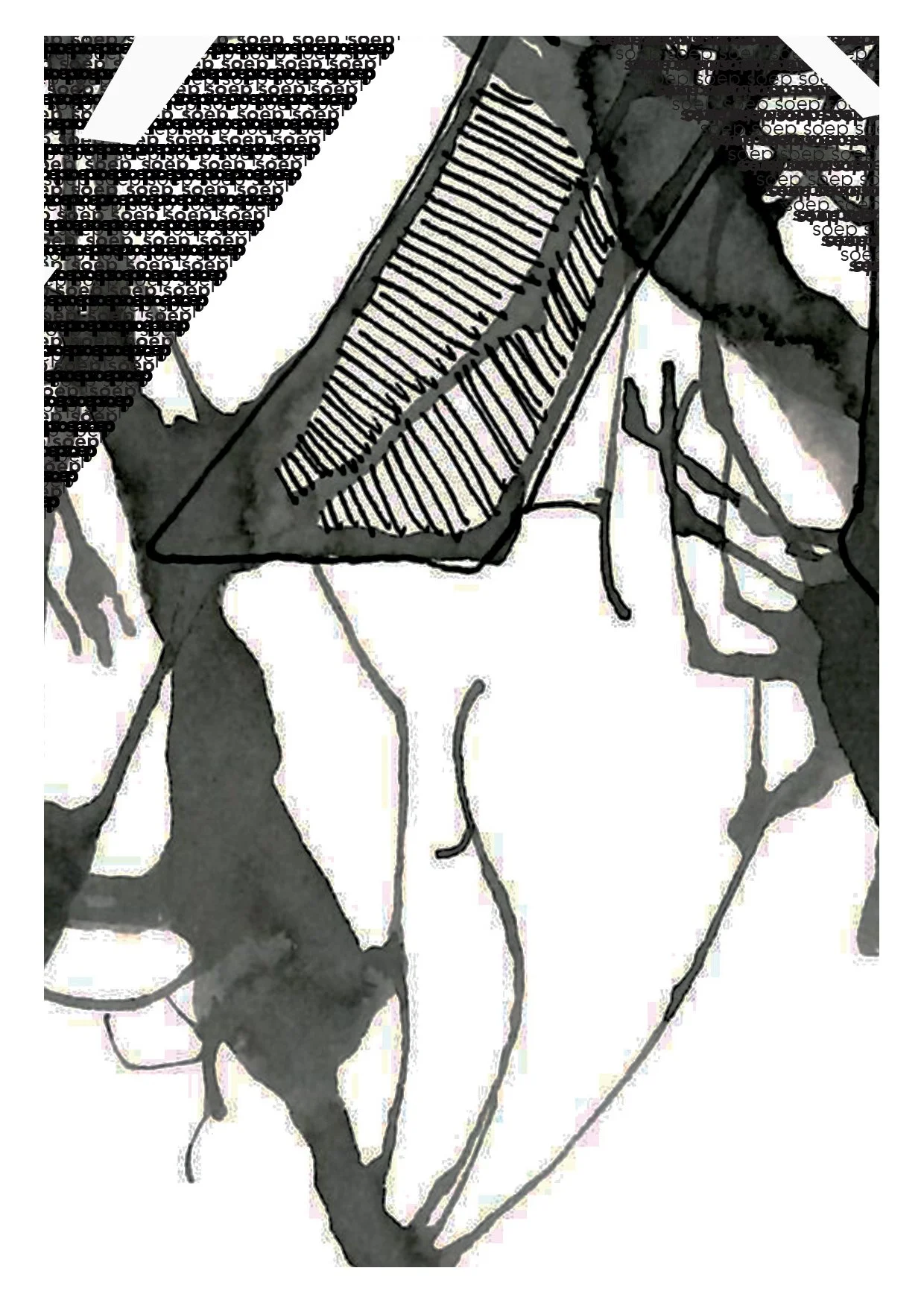
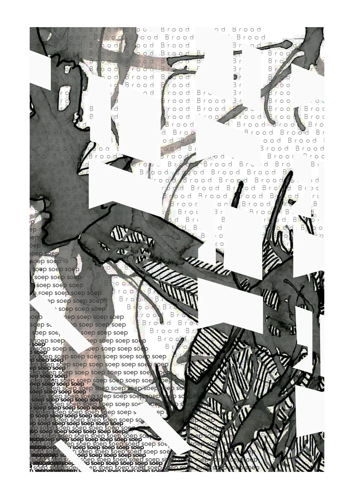
Mark Making -
One of the more extensive projects revolved around mark making. The first task was to create 40 A5 mark making pieces. 20 in black and 20 in with the addition of a colour. I chose blue. While the task never explicitly said not to use illustration, I took that as an opportunity to add a bit extra to my marks.
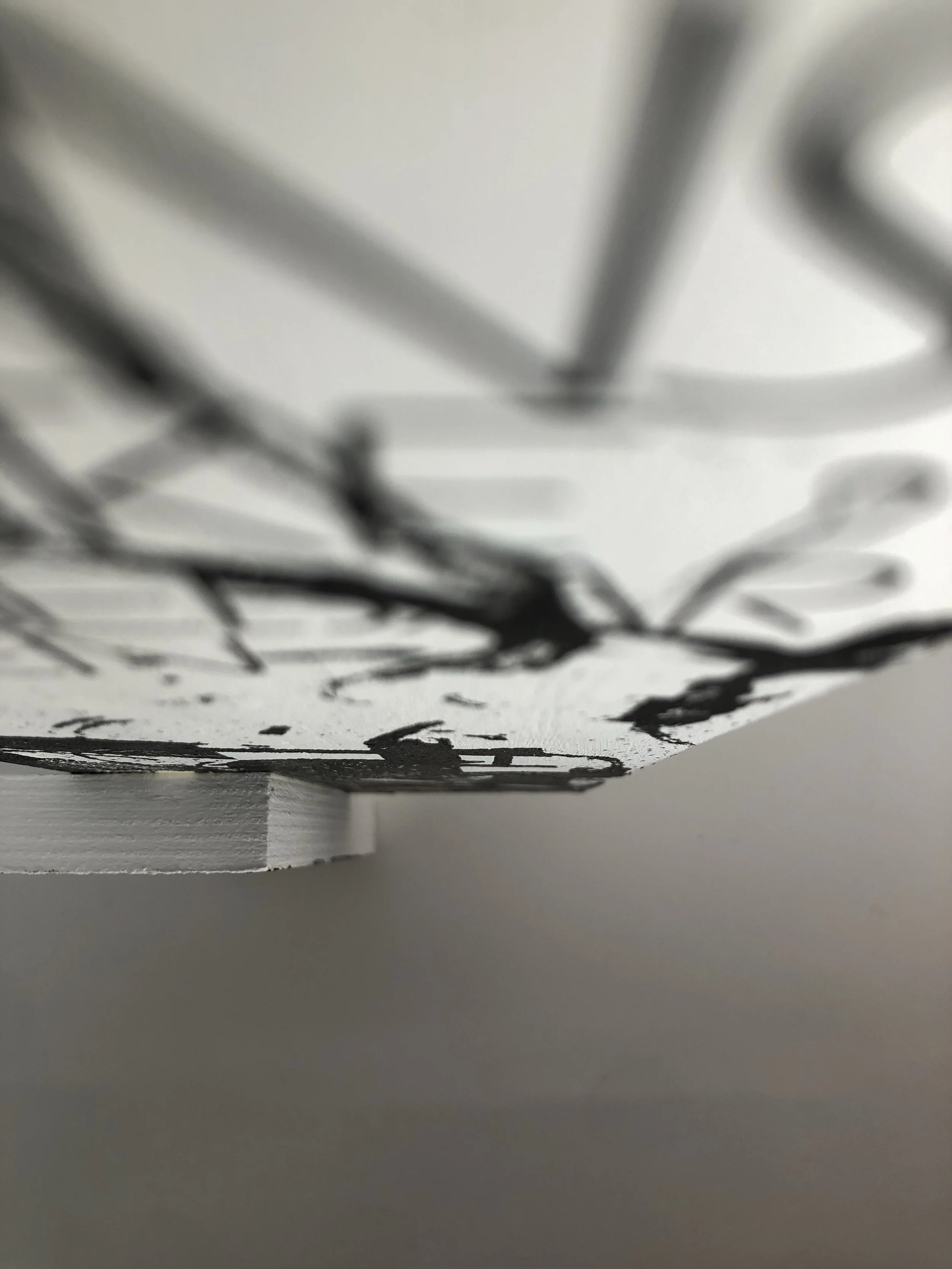
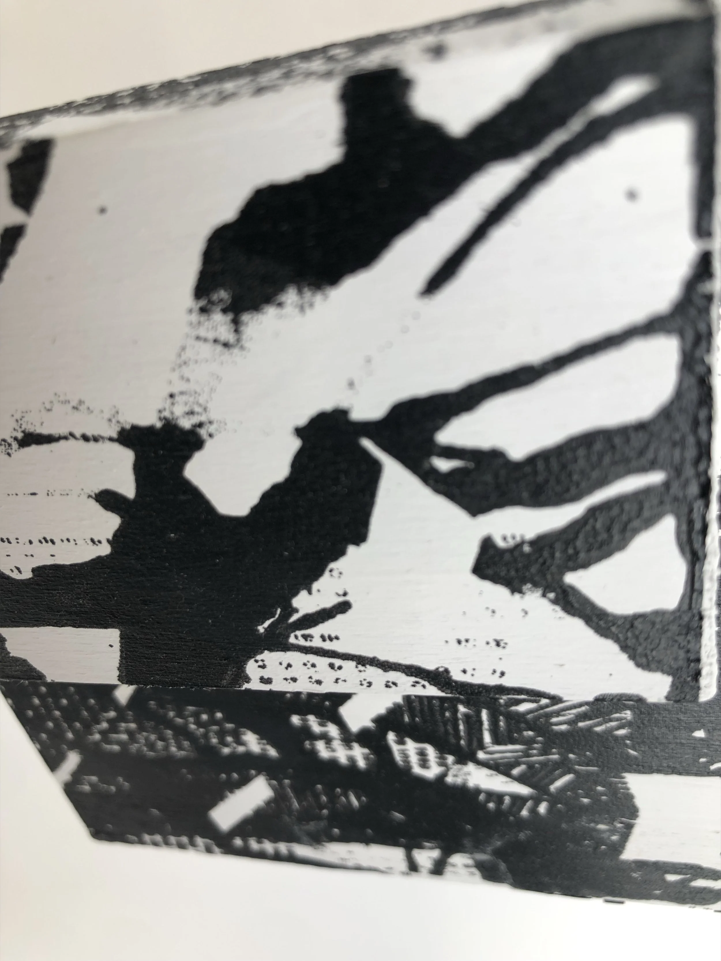
Mix Media Wood -
Another task within the Mark Making project were these wood responses. Using screen printing, vinyl lettering, paint and pen. We created 2 wood sculptures, which were finally displayed in an exhibition.
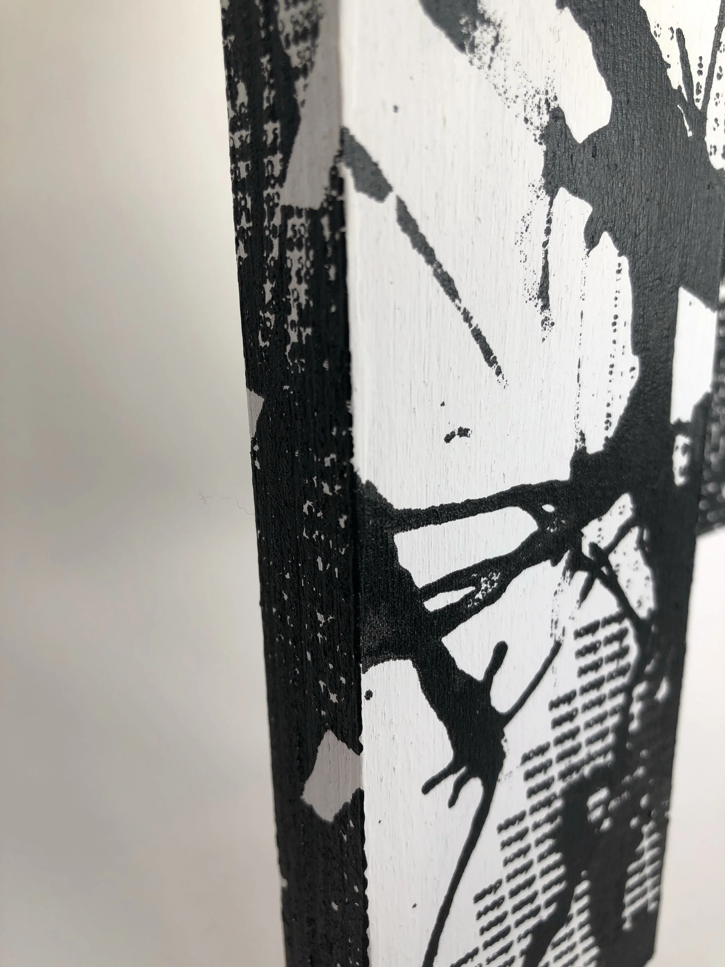
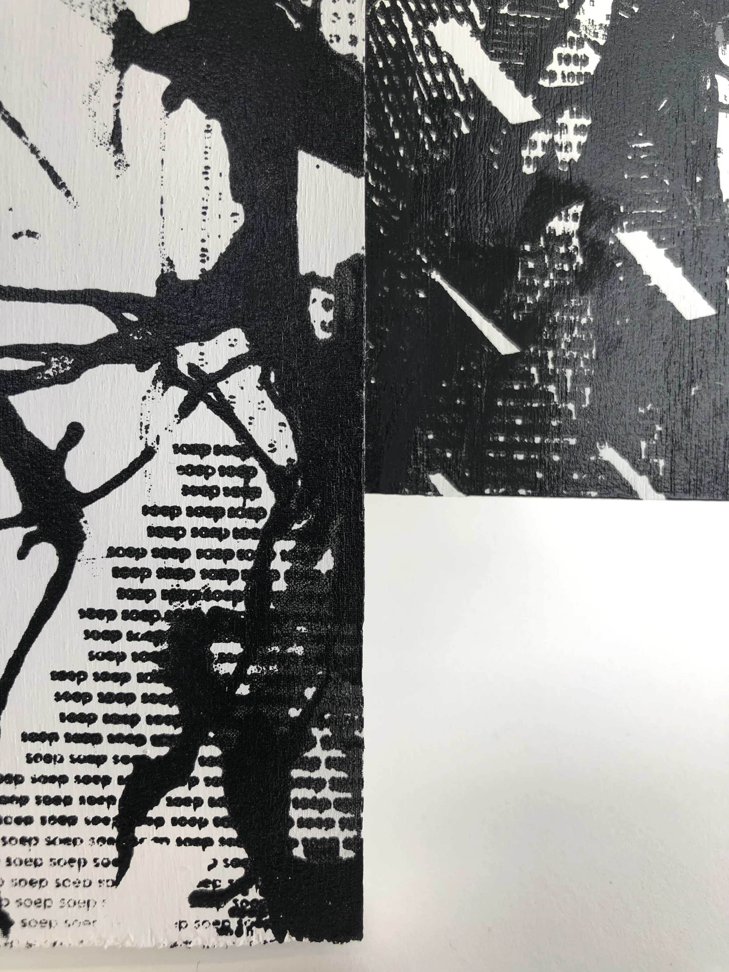
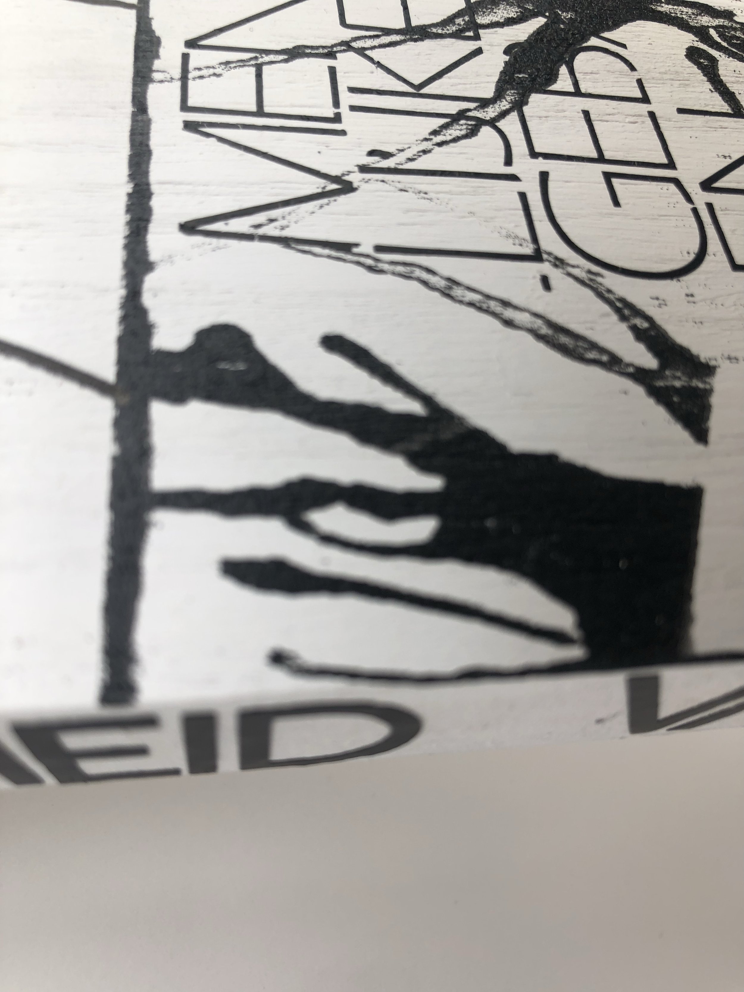
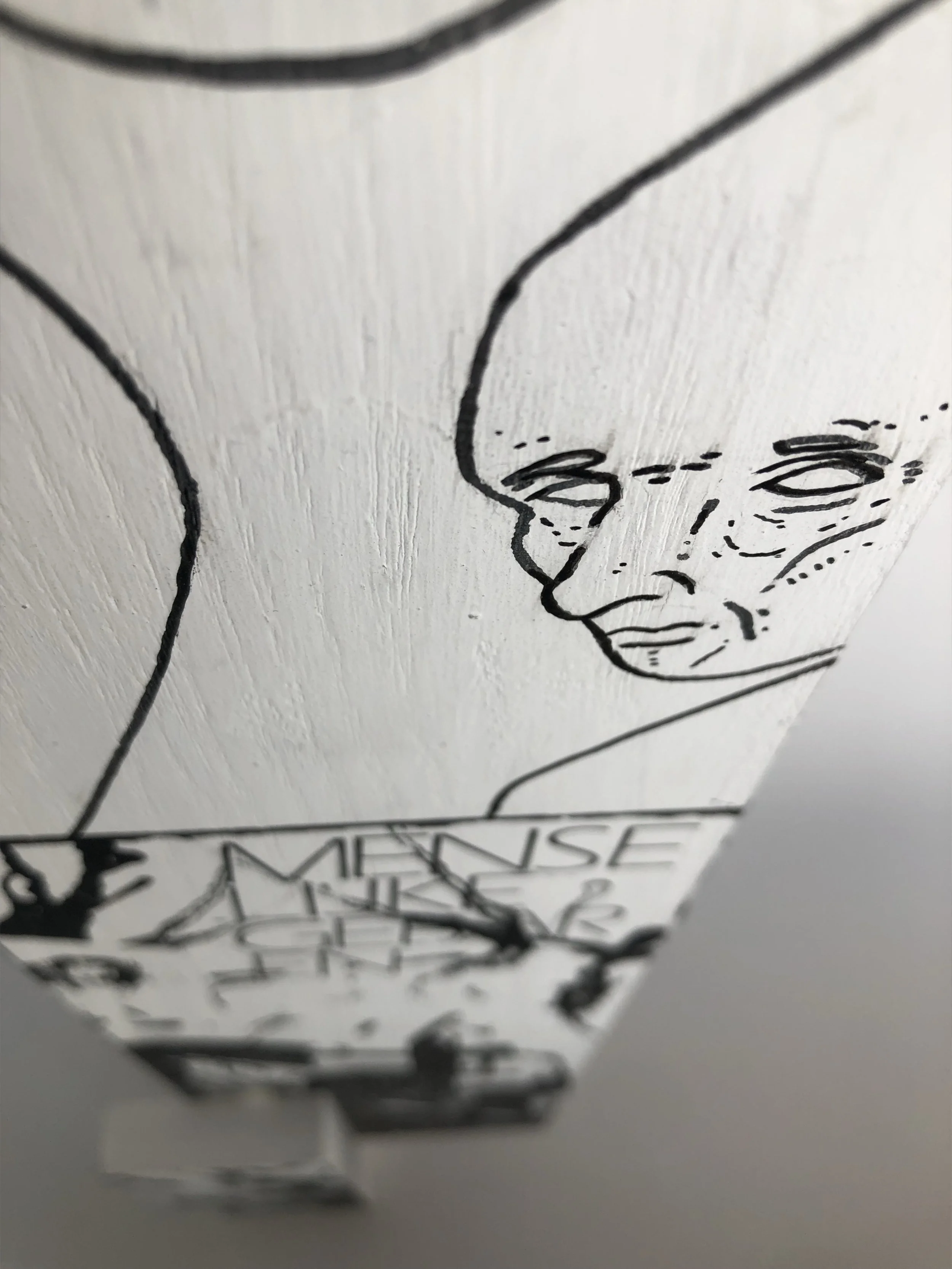
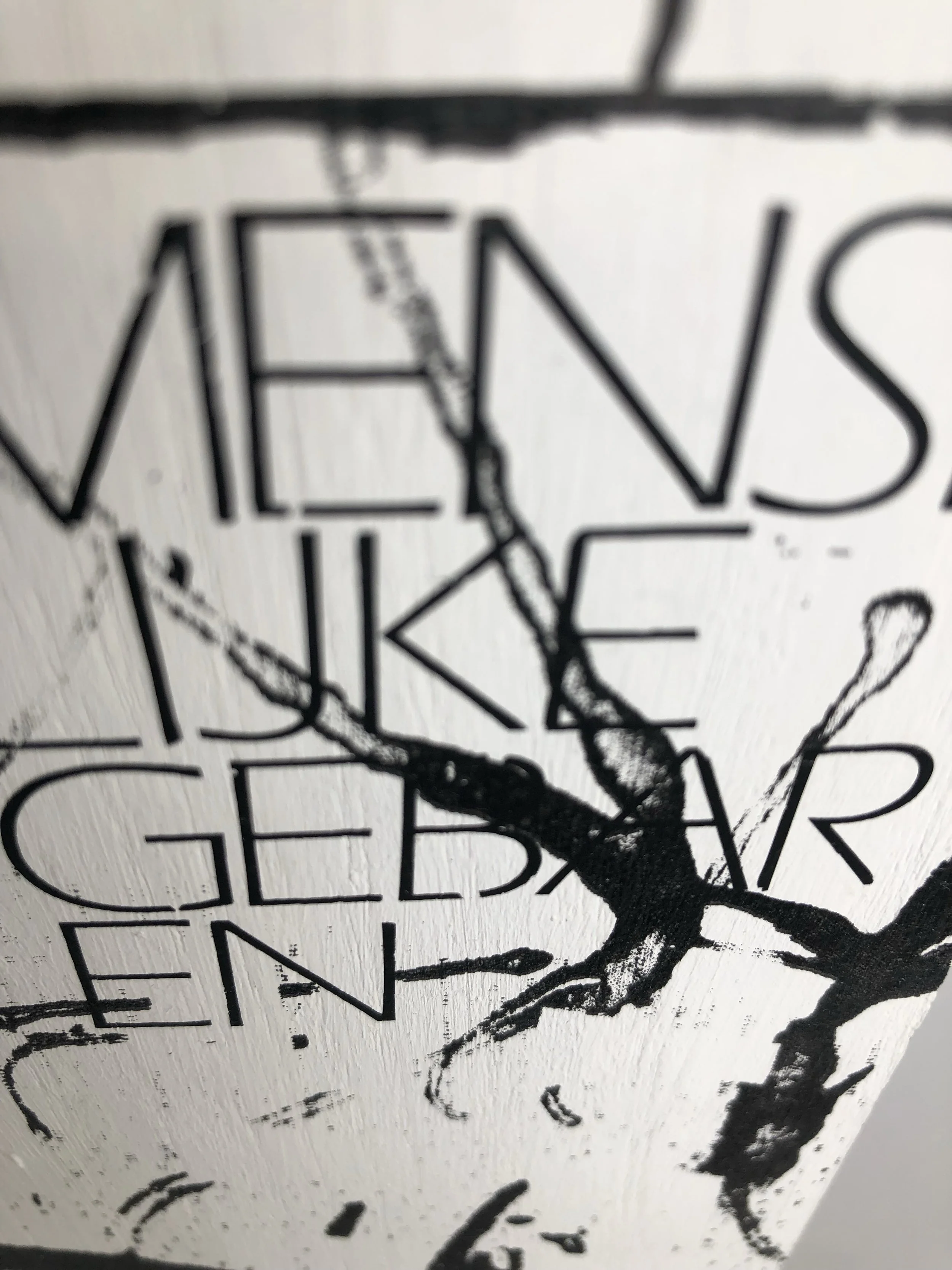
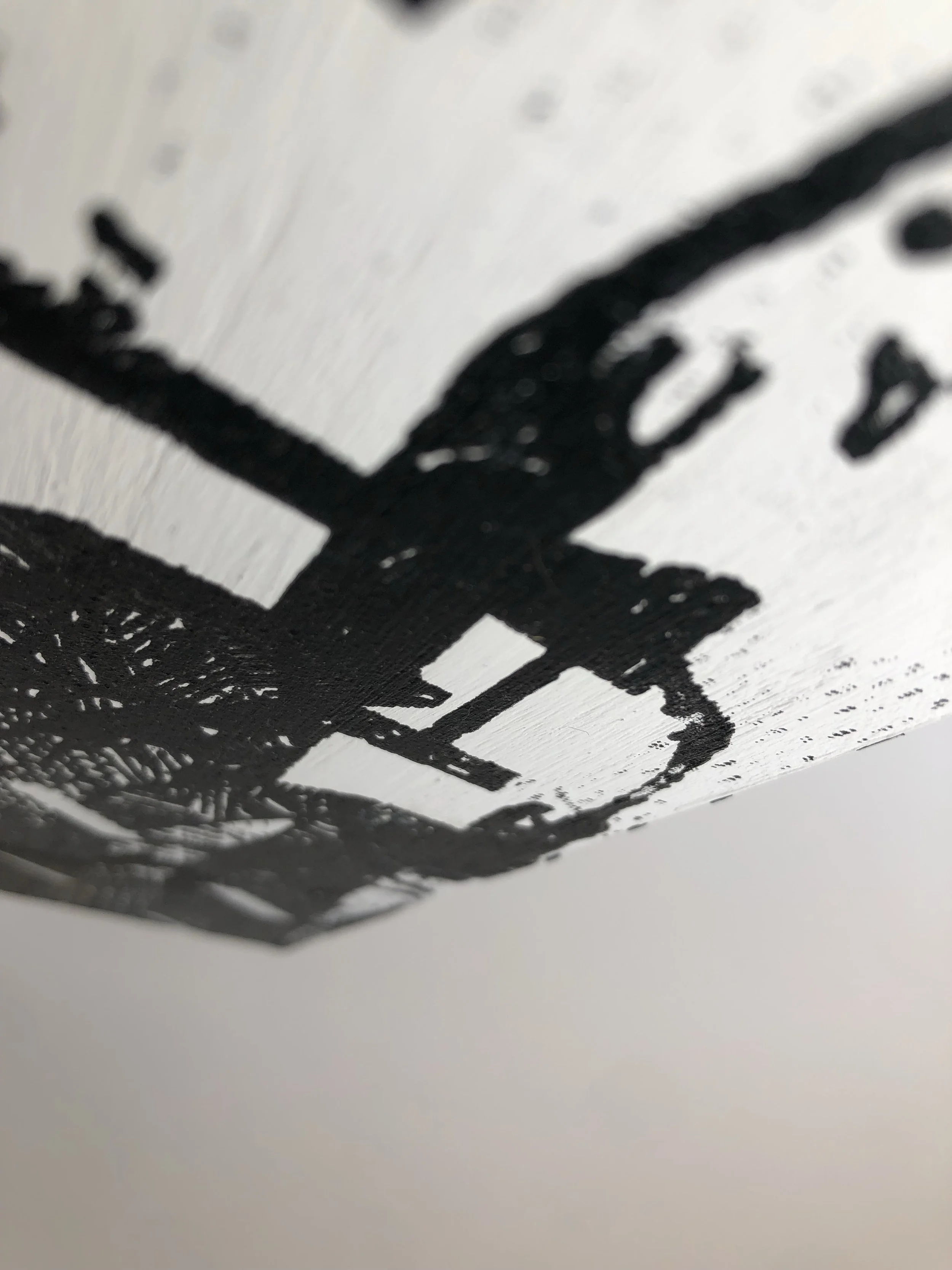
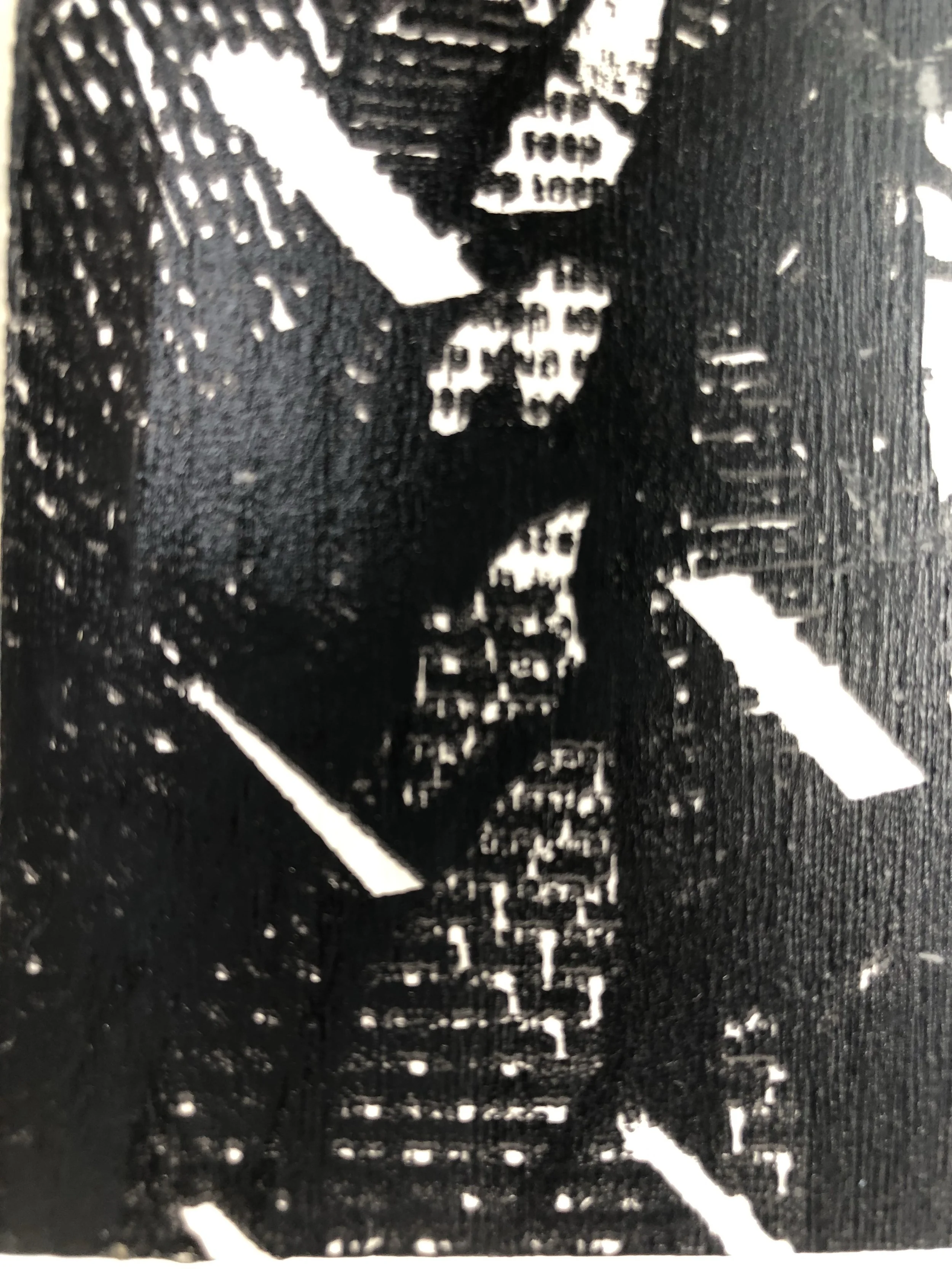
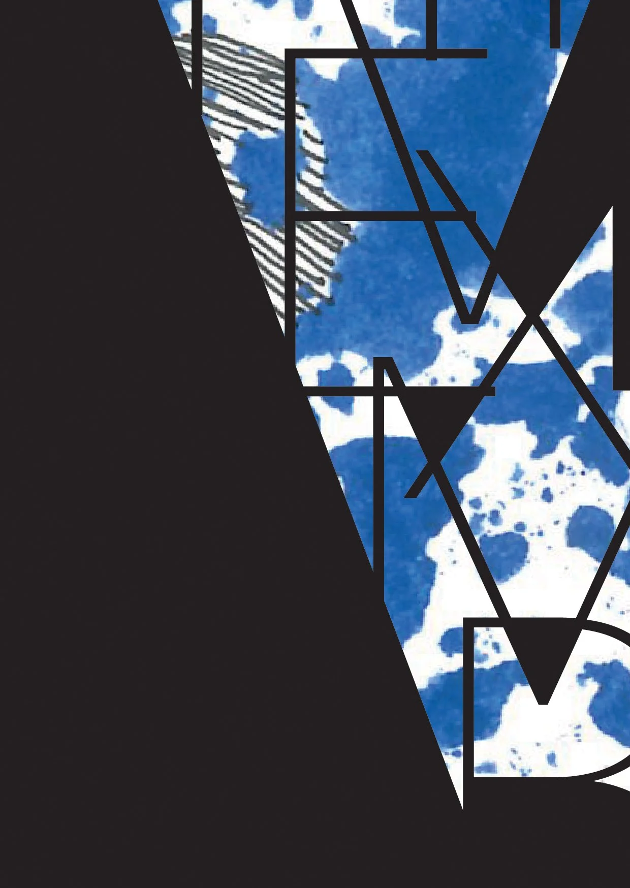
Typographic Buildings -
These typographic and mixed media buildings were also part of the same wider branching mark making project. These designs were eventually printed onto large canvas sheets and exhibited in the 3rd year ending show.
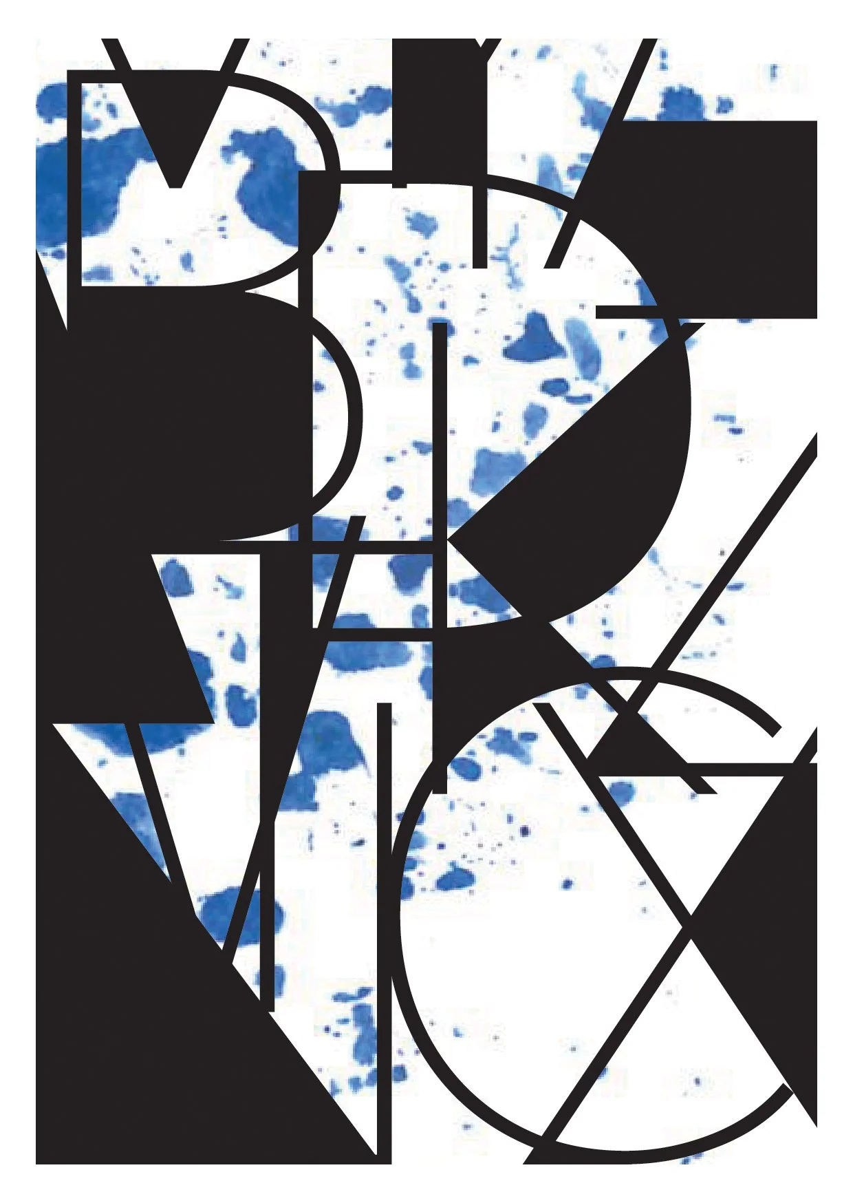
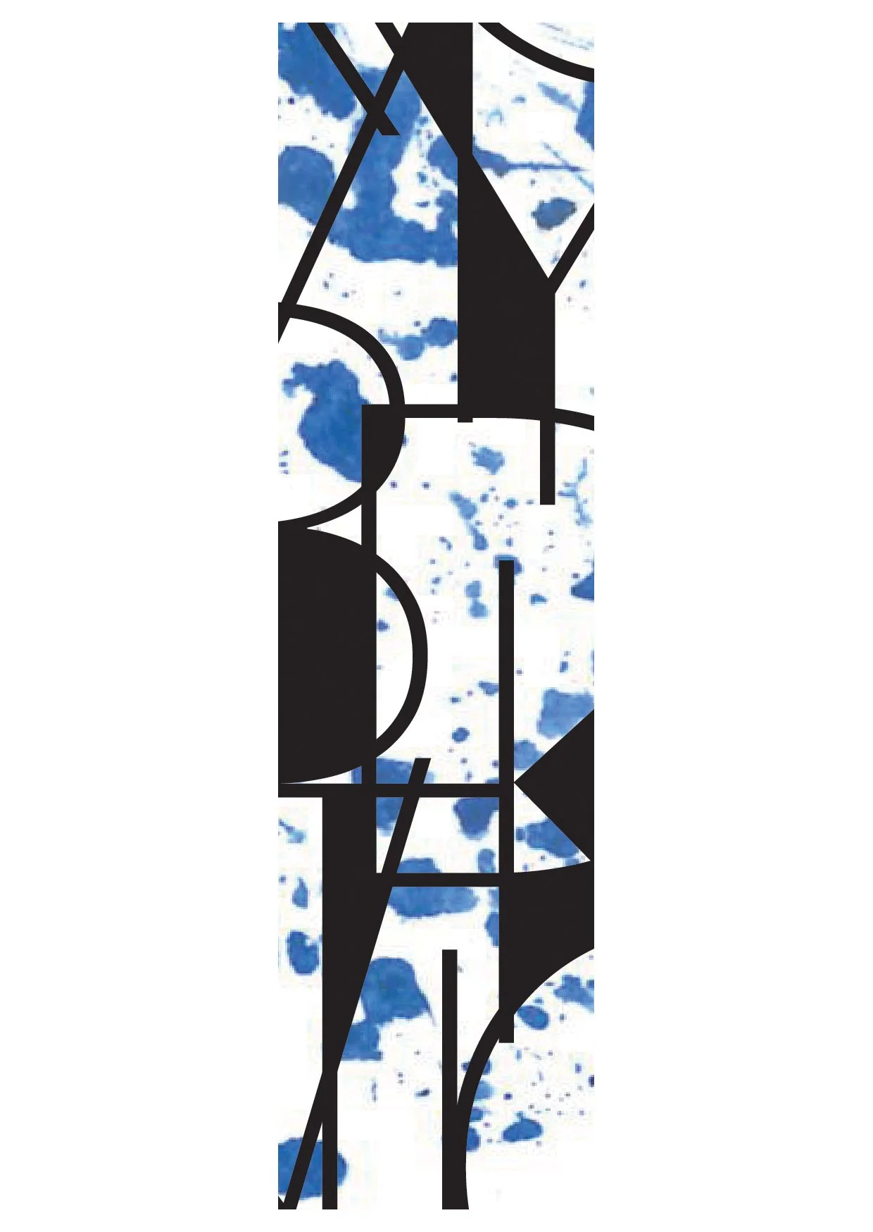
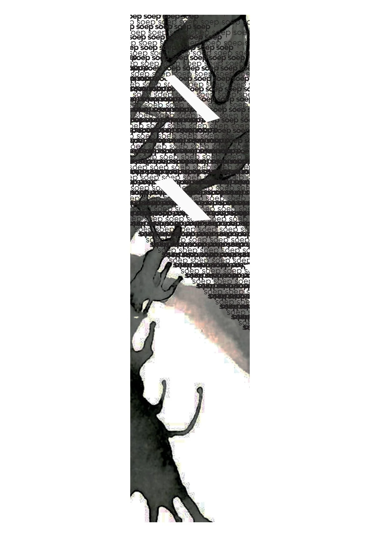
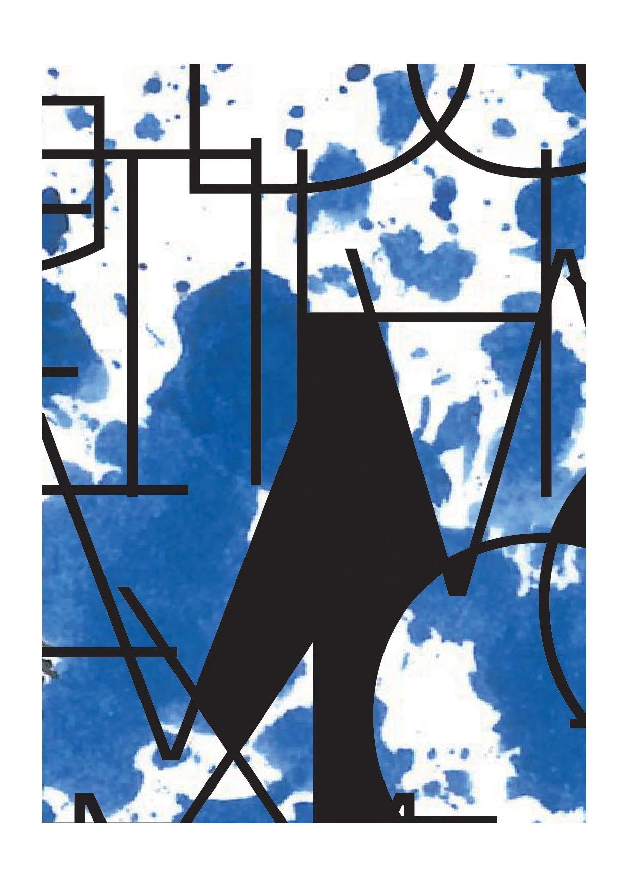
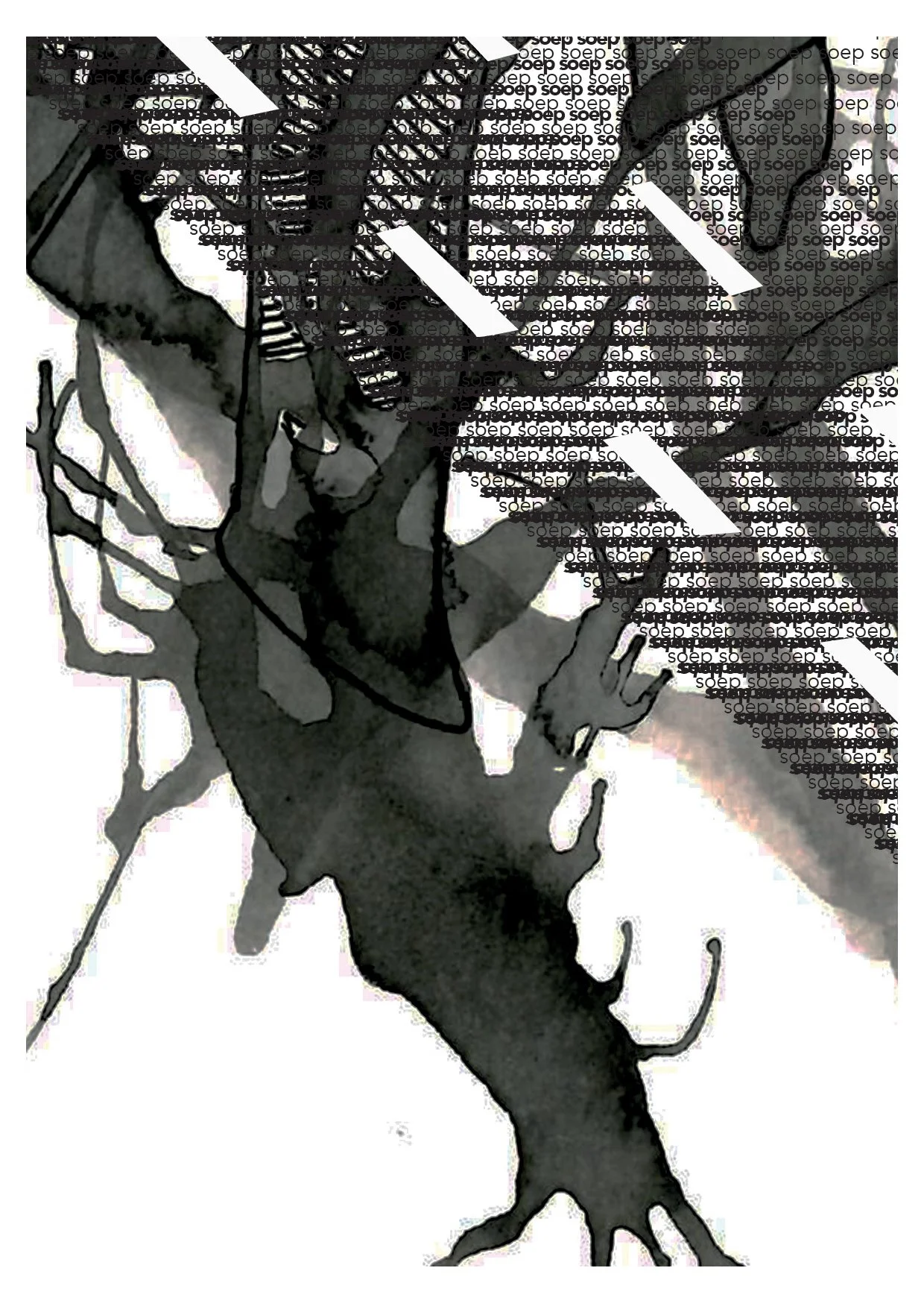
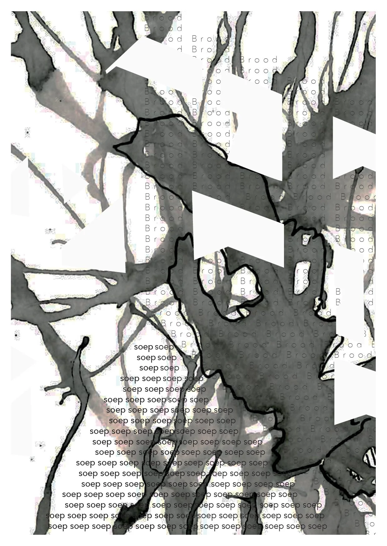
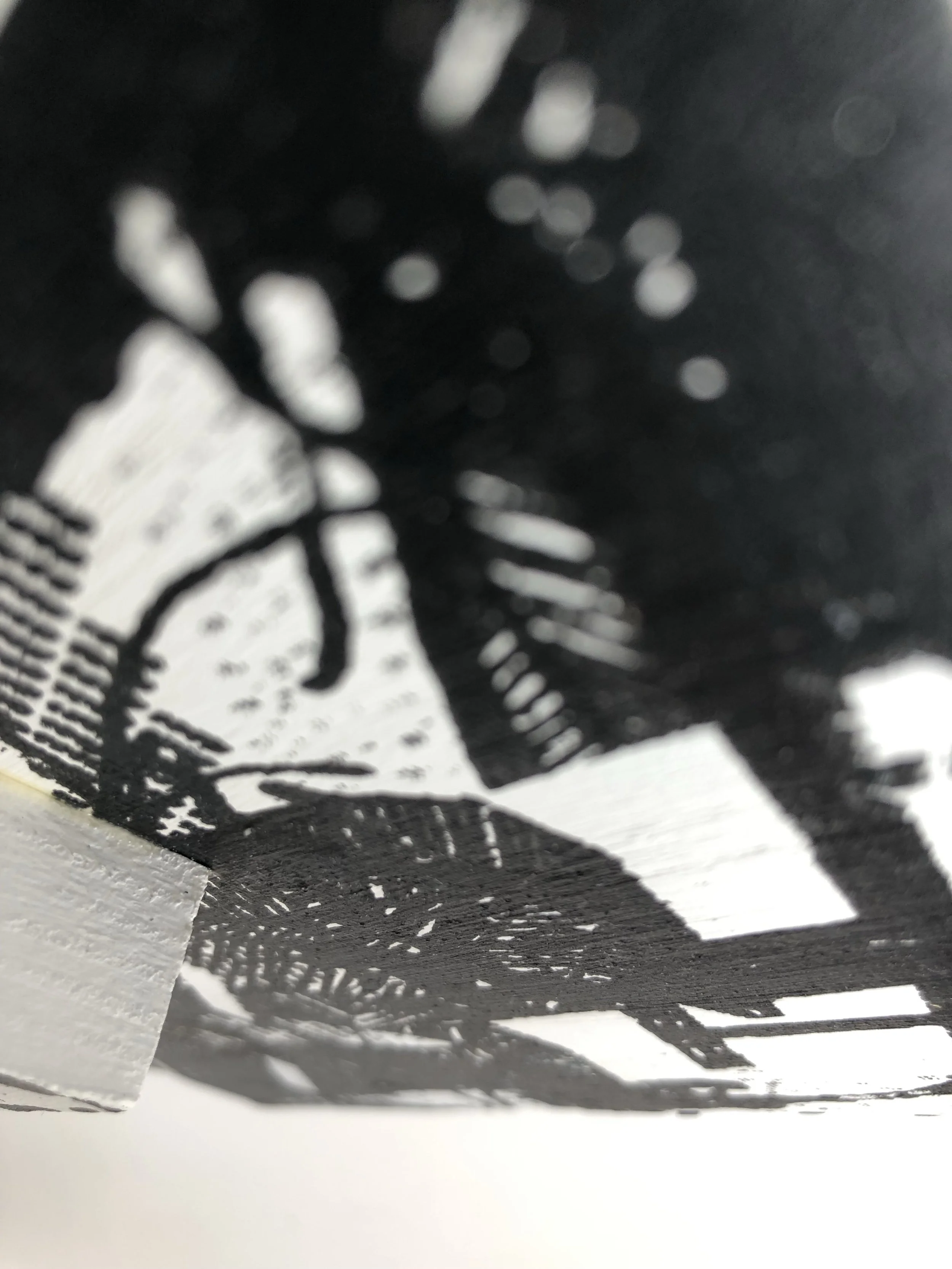
Typographic Buildings Extended -
The building prints above are various close ups and edits of the two original typographic building designs.
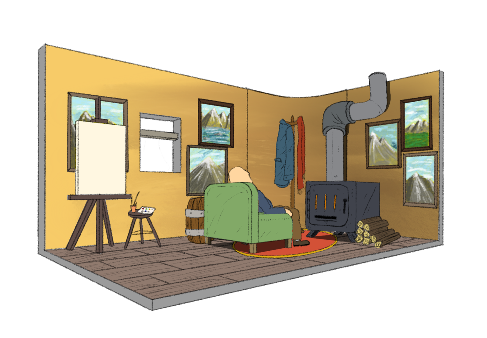
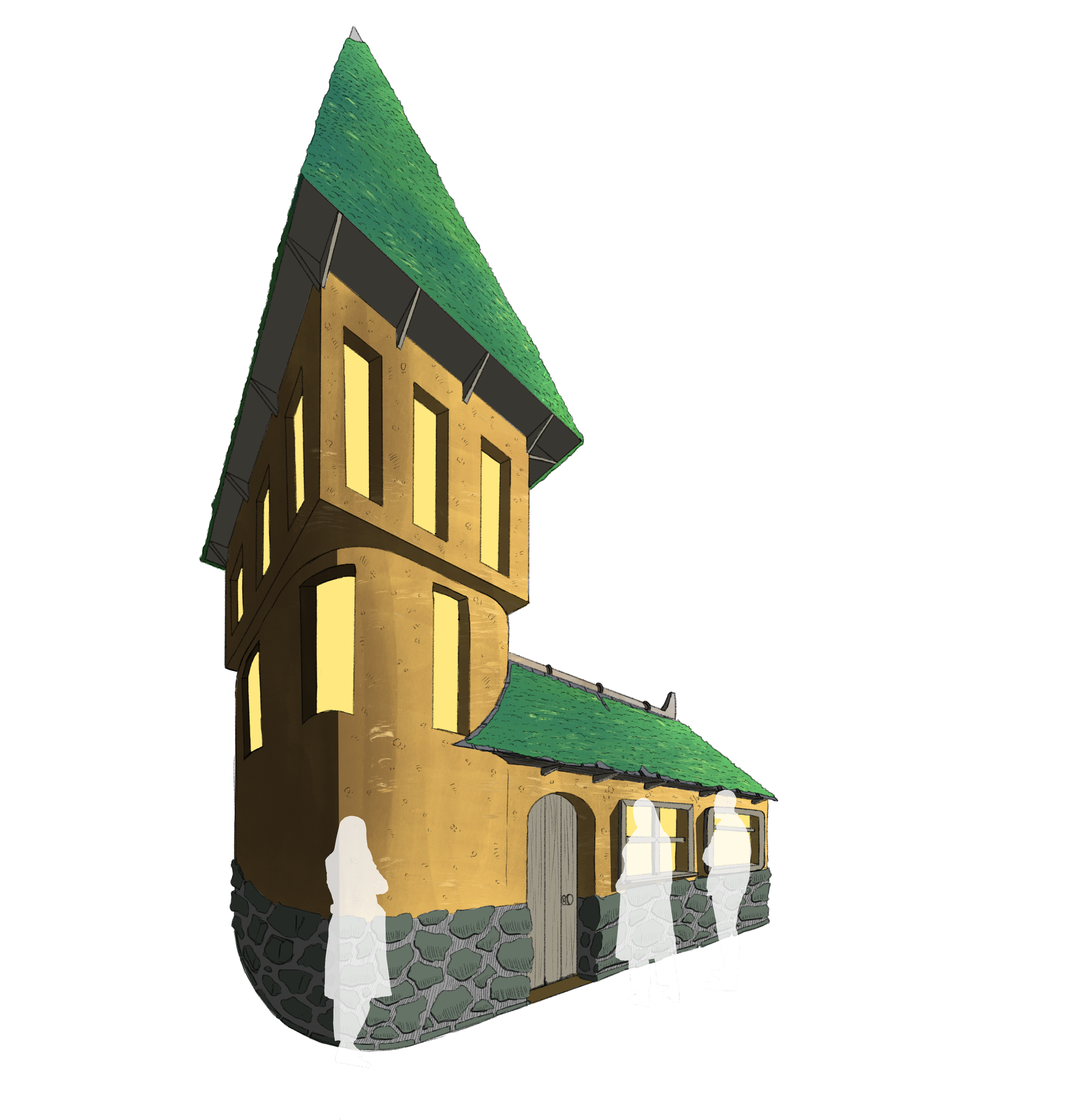
Design Project -
Our 3rd year design project revolved around stalled spaces and how they could be brought back to life. My idea was for an old disused public bathroom on the Irvine Green to be turned into fantastical building, taking strait from a fairy tale. Within, a sleeping man with a series of exhibited art works. This being a public exhibition space, which would showcase local artists. I struggled deeply with this project and found little enjoyment in it. It became mostly about design within architecture and learned that in future project to not get bogged down with self doubt. Trust your gut, and that is shown in in my 4th year work.
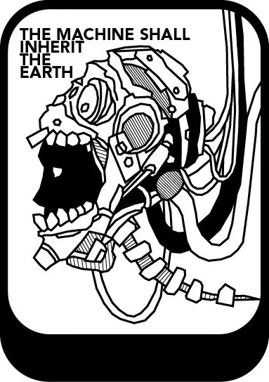
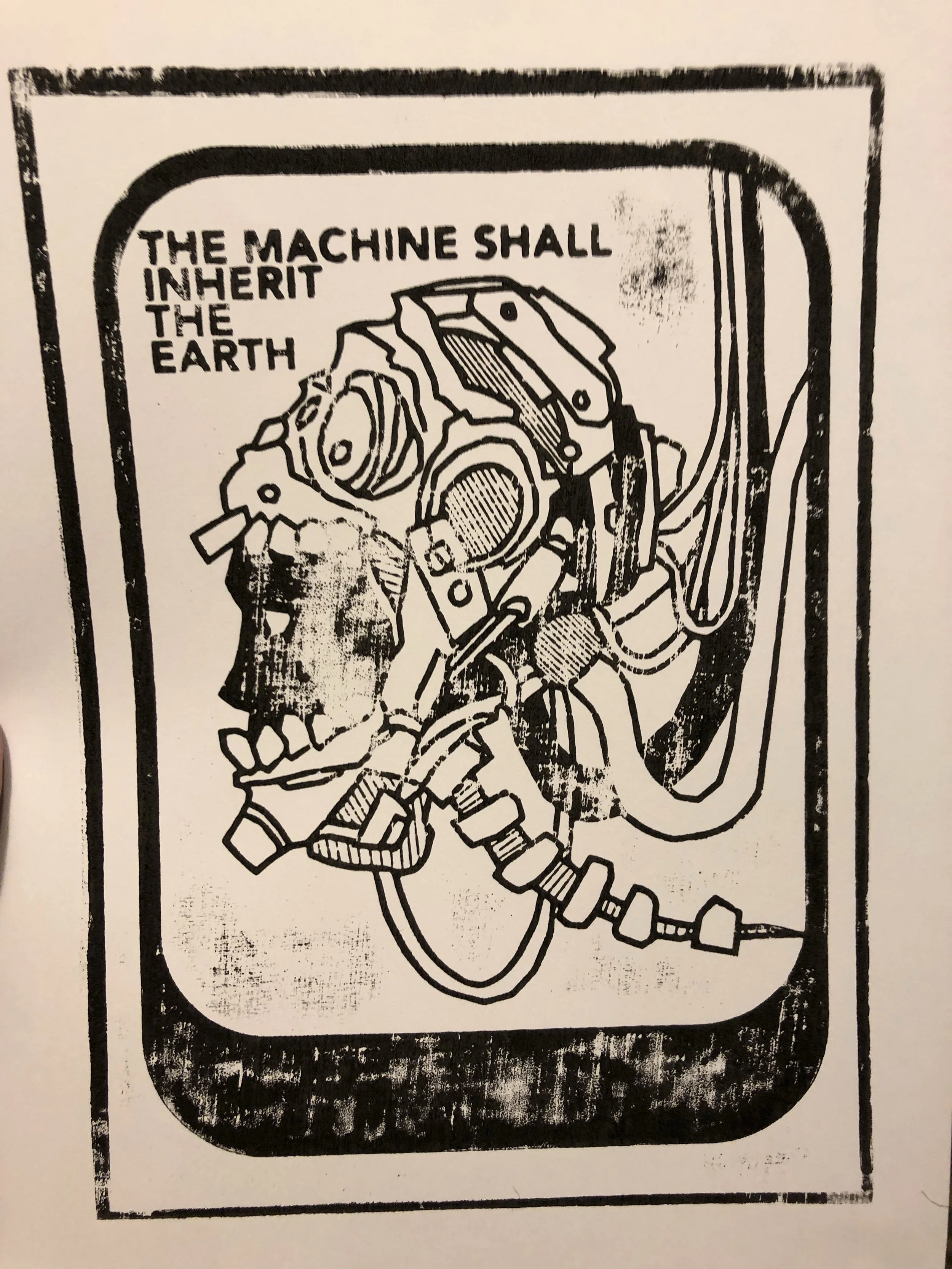
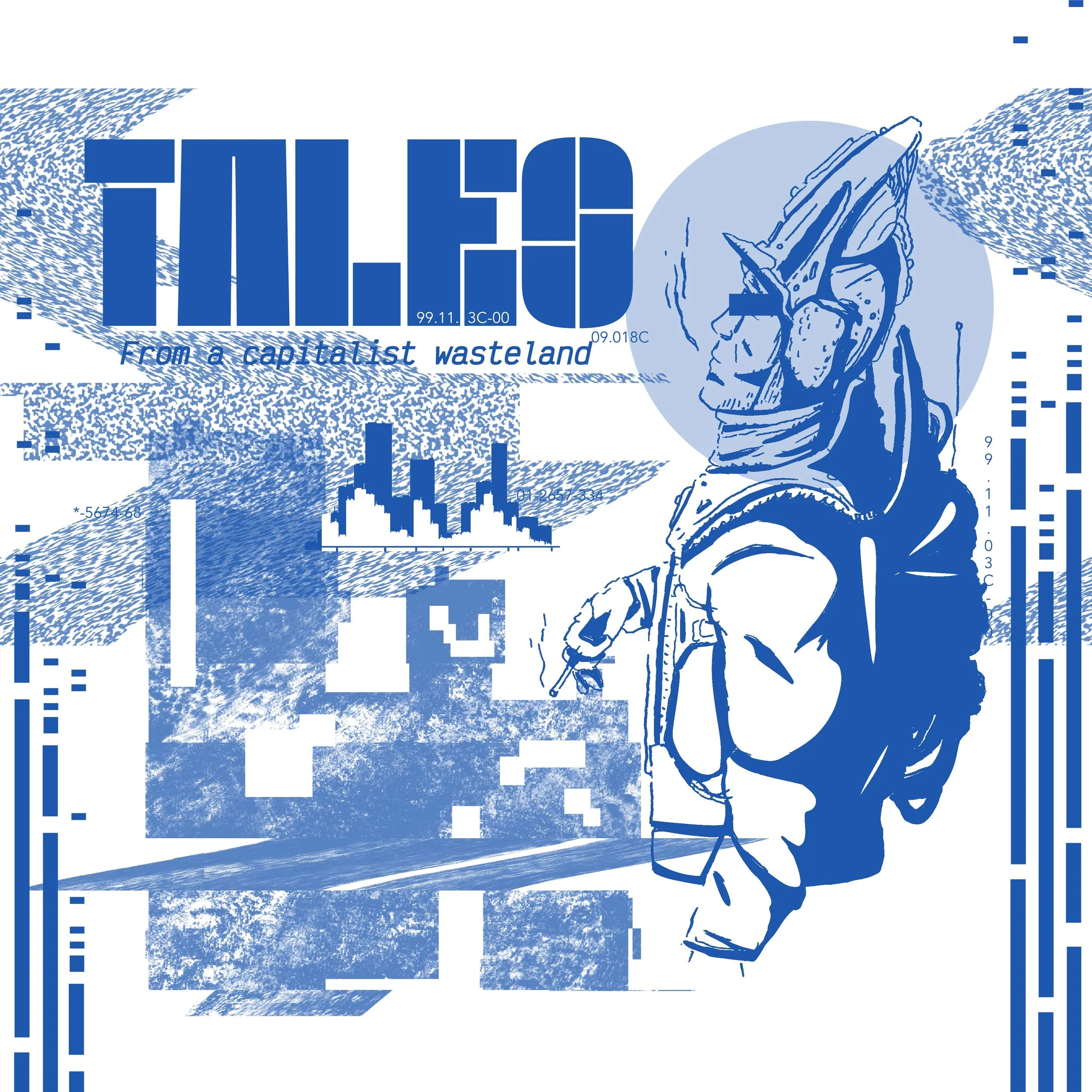
Laser Cut Workshop -
In our 4th year we got the opportunity to partake in a laser cut workshop. In which we would a motif as part of our design project. It was to be related to our chosen subject, mine being world building and visual story telling. So I created this cyber-punk dystopian poster, first as a thumbnail, then digitally and scanned in Illustrator. The skills I picked up became and work I produced inspired me to pick up laser cutting as part of my Moerheim advanced design project.